HTML5 video had a bit of a rough start a few years back, mostly due to inconsistent support and lack of agreement on codecs. Each of the major browsers threw in support for preferred codecs: Apple/MS wanted H264, partly due to the massive support and hardware support. Google wanted WebM (VP8 & VP9), its lovechild and FireFox wanted to use Ogg Theora, the most open and problematic of the three warring codecs. After the dust settled, developers had a few options: continue to use flash with h264 for mobile, use HTML5 video and support all video files, and lastly use HTML5 + a flash wrapped for h264, so all browsers were supported.
As of writing this, FireFox was the last major holdout until Cisco bought and licensed H264). That said, in the interest of an open web, most designers should opt to provide more than mpeg4 for legacy support, at least for the next year or two. For now, simply providing H264 is enough to support all modern browsers but the video tag wars aren’t finished, with H265 (MPEG5) vs VP9 (webm) looming.
Providing support for all three legacy video formats is a royal pain, mostly due to the lack of easy to use tools. For example: The popular video encoder Handbrake will encode to VP8 and Theora in a MKV wrapper but this won’t work for HTTP access. FFmpeg has support for both webm and ogv, but is geekier than my needs and Sorenson Squeeze, while a fantastic product hasn’t been budgeted for the project I’m working on.
What you’ll need:
Source video file (preferably high bit rate MPEG4)
OS X
The tools you’ll need:
VLC - Powerful and easy to use open source video player, can playback WebM and Theora
ffmpeg2theora - Command line utility for creating Theora
Hybrid for OS X - GUI wrapper for many open source tools, supports WebM
Note if Hybrid doesn’t work, I’ve found that Hewbo Video Convertor works. It’ll crash after finishing an encode, but the video files it produces are good.
Creating a Theora (ogv) video
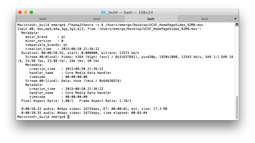
ffmpeg2theora is a command line utility but fear not. It’s actually easier than creating WebM videos. After you’ve installed ffmpeg2theora fire up your terminal.
ffmpeg2theora only requires specifying the audio and video quality and source file to process a video file. It may take a few trials and errors to produce the lowest yet still watchable WebM video. I found that using a video quality of 6 worked fine for my video needs for a background video.
In the terminal type the following with a trailing space:
ffmpeg2theora -v 6 -a 7
Now drag the video from your desktop to the terminal window, and the terminal will automatically create a file path that looks similar to this:
ffmpeg2theora -v 6 -a 7 /Users/emerge/Desktop/video.mov
Soon as you hit return, your movie will start converting; it may take awhile depending on size/length.
If you’re creating a background video, simply ignore the audio setting:
The terminal window will continually update with estimated size and time to finish. I found my videos were significantly smaller than the estimated size.
Creating a WebM VP8 video
WebM is a container format much like other containers are: AVI, MOV, MKV. WebM containers can have VP8 and VP9 video. Since our goal is maximum legacy support, we’ll want to use VP8 when we create a video.
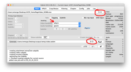
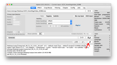
WebM is more of a pain to create, and so far Hybrid is the easiest freebie utility I’ve found, and it’s a mess. Fire up Hybrid.
Step 1:
Specify your source file, your codec, and your output.
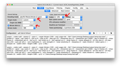
Step 2:
Click on the VP8/9 tab and set your bit rate. This is a bit of trial and error so try something like 2000 VBR for starters; I was able to get away with 1500.
Step 3:
Go back to main and click add to queue
Step 4:
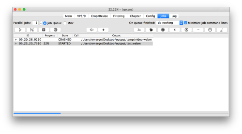
Click on jobs and click the arrow on the left to start your queue to encode.
Step 5:
Be sure to check your results in VLC. Now you’re good to go.
Alt Method for WebM: Encoding on the cheap
If Hybrid proves too problematic, the $1 Hewbo Video Converter works too, and its GUI isn’t nearly as confusing. After every encode, Hewbo crashes, but the video files are good. At worst, you have to relaunch the app after every encode.
So both my Windows installs (media PC running 8.1 and bootcamp running 7) started display Windows 10 adware, glad to see MS is taking cues from Freemium and malware, including a toolbar icon dedicated just to annoy users.
With a little googling, I discovered that the KB3035583 update is the culprit.
The solution
Step 1:
Go to Control Panels -> Programs and Features -> Installed Updates and search for KB3035583, and remove it. It may take a few moments to find.
Step 2:
When prompted, Reboot.
You’re now Windows 10 spam free. Be aware of the windows update you must first go to installed updates before searching. Otherwise, the search will not find KB3035583.
This winter I’m retiring my HTPC for a Hackintosh. I’d rather venture into the realm of unsupported hardware than continually be fighting MS’s data mining.
Nearly a year ago, I wrote what I’d consider the definitive review of CodeKit 2, which spanned nine months of usage, several versions, and at least two major projects. It was filled with the ups and downs of CodeKit 2 vs. Grunt/Gulp vs. Prepros, and even my inevitable transition away from GUI task managers.
Long before that, I wrote a cursory and problematic review of Prepros 4. I’ve meant to follow up my CodeKit 2 review with an equally ambitious Prepros 5 and just never found the time until now. I’m sure the developers of CodeKit and Prepros would likely prefer being considered separate properties but its impossible to review one without mentioning the other.
Reviewing an application like Prepros comes with some difficulty, unlike most applications, Prepros is meant to run in the background. In fact, you’ll probably spend little directly time interacting with it. The most useful feedback Prepros provides is an error log that reports back when you write improper code. Task managers are complicated beasts as they are a swiss army knife of various utilities smashed together.
For those new to the world of preprocessors and task managers there’s quite a learning curve, and to review this product the reader needs a basic understanding of a few core terms.
Seasoned devs can safely scroll past my quick glossary of terms.
Quick Glossary:
Compiling - The process of converting programming into useable executable code. There are many types of compilers, such as ones that create executable applications for computers/phones. In this review, I’ll be referring to the simple act of converting a programming language to a browser readable language such as Sass to CSS or Markup to HTML.
Preprocessor language - A programming language the compiles to another language. In order to run this code in a browser, it first must be processed before a web browser can consume the code properly.
Task Manager - Programs that are configured to perform preconfigured tasks when trigger automatically. Task managers “listen” and automatically run a series of instructions based on a trigger event.
For front-end web development, this usually means when a file or directory has been modified. Tasks can be chained together such as to convert LESS to CSS and reload the web page on save. The most common task managers are (in no particular order):
Prepros - A cross-platform utility with a graphical user interface
Codekit - A Mac-only utility with a graphical user interface
Minification - Every keystroke takes up minuscule amounts of data, measured in bytes. Minification takes out unnecessary keystrokes from HTML/CSS/JS and creates a “minified” version of your code, With Javascript, even variable names are replaced with short names to save data. This additional step is called uglification. Since HTML/CSS/JS are the instructions that your browser needs to render the page, this will help aid page load speeds considerably.
Concatenation - Concatenation (concat for short ) when programming means combining to two variables’ stored values. When applied to file management, concatting means combining multiple files into one file. This allows, for example, many javascript files to be combined into one JS file for distribution. This reduces the number of requests a web browser must make, and thus (usually) speeds up the data transaction from the web server.
Uglification - In order to say bytes of information, javascript can be not only minified but have variable and function names changed to smaller names. For example, a variable named “LeftMarginSpace” will be automatically changed the “a” and all such instances when compiled. Using tricks like this, javascript can shave even more space, and the reductions can be significant on larger scripts.
Sourcemaps - Modern browsers support additional CSS files called source maps, files that list where CSS rules are written, and only applicable when using inspect element. In Sass/Less projects, typically developers divide their CSS code into many files and compile one big minified file. To make development easier, the web browser will list where the appropriate CSS rules are written relative to the Sass and Less files, including a line number. For more information on source maps, visit Treehouse’s post, “An Introduction to Sourcemaps”.
Why do we need Sass and Less and Stylus?
CSS isn’t a difficult language to write, but as the web has grown, the scalability of CSS can be difficult to manage. Preprocessor languages such as Sass and LESS enable developers to manage larger projects more easily and write code more efficiently and cleanly, by using programming techniques like variables, statements, nesting and so forth. With a simple For Loop, a developer can generate an entire CSS grid. Other developers have attempted to do this same thing with Javascript for what Sass/LESS/Stylus/PostCSS has done for CSS, using CoffeeScript and Typescript, and even HTML with languages like HAML.
Many other developers have explained the necessity of Sass and LESS far better than I could ever hope to, and I suggest reading articles such as A List Apart’s argument for Sass.
What is Prepros?
Prepros is an application that allows you to automate the compiling of popular preprocessor languages like Sass/Less/TypeKit/haml/jade into browser readable code and refresh your browser, much like Grunt.js and Gulp.js.
Instead of using esoteric config files and the command line, Prepros lets users enjoy the benefits of preprocessing without much pre-setup. Many users are much more familiar with GUIs and thus will feel comfortable using Prepros.
Setup is easy and only requires dragging and dropping, and a few mouse clicks.
About my workflow
With web development, workflows vary considerably so when I’m writing this review; it's almost impossible to pull myself from my workflow as it predicates my needs. My official title is UX developer, and I work professionally as a front-end developer, I live Sass every day, so task managers are my life.
I’ll quote myself from my CodeKit 2 review:
At my current job, our tech stacks vary a lot. In the last year, I’ve worked on projects that use Django, Drupal, Wordpress, Expression Engine, internal PHP, Python, Angular, Jekyll and even an ASP.net project and a few old Coldfusion legacy sites. 95% of our sites are Sass, although there a few LESS projects and even one plain ol’ CSS site.
Internally, we have staging servers managed by Jenkins. Most of the time work off of a localhost using Apache (or Python’s server).
On an average day I’m bouncing between Sublime Text, Tower (Git), Photoshop, ImageAlpha + ImageOptim, Sketch, VMware/simulators and a host of small utilities (Colorsnapper, Rulers, GhostLab) along with whatever tech stack I’m working with that day.
Very little of one’s time using a task manager is spent in the actual application. When you use Prepros, you won’t be staring at the window. Instead, you’ll have it tucked quietly into the background and only occasionally glance at the error log. This isn’t bad, in fact, it's a very good thing.
Prepros is built on Node.js and Ruby in an OS X wrapper, meaning its built on the exact same tech that you’d use in other task managers such as: imagineoptim, chunky_png, compass, execjs, sass, slim, susy, temple, using GitHub’s Atom Electron Framework as the cross platform engine.
IIf you don’t understand what this means, that’s okay; it’s built around industry standard technology stacks so the behavior is akin to using command line utilities.
Setup
The initial setup of a project starts by dragging the folder you wish Prepros to monitor (or watch) and detect changes. Once the folder has been added, there are project options that allow you to specify where you’d like code to compile to, check boxes for options such as using Compass with Sass, generate CSS sourcemaps, uglify Javascript and so forth.
Also, you’re able to create an intermediate server, which will perform live reload, refresh upon saves and (more on that in a bit).
Image Optimization
Prepros uses ImageOptim, a popular image optimization library to squeeze extra bytes off images, losslessly. Images generated with popular applications often include erroneous metadata and do not use the latest, high-efficiency encoding. ImageOptim is a hassle-free way to reduce the overall sizes of PNG and JPEGs without affecting the image quality. Google recommends this by default.
There are utilities like ImageAlpha that allows you to scale down PNGs further by reducing the color palette, then applying the ImageOptim tweaks for maximum efficiency.
Prepros offering image optimization is nice to have, but like CodeKit, I rarely made use of it as almost every asset I hand prune using utilities like ImageAlpha.
Using Prepros’s image optimization should be considered one’s minimum for image optimization.
Code Compiling
Prepros’s ability to compile popular preprocessor languages is where Prepros gets its namesake. For most users, this will be the main function of the application. The list of languages that Prepros supports are:
CSS: less, sass, stylus, scss,
HTML: jade, haml, slim, markdown,kit
Javascript: CoffeeScript, livescript
Each of the CSS languages has a set of options, including concatenation, sourcemaps and so forth.
There are some nice options such as auto switching compiling engines in the case of Sass. Compass, for instance, remains incompatible with LibSass (the Sass compiler written in C/C++). Enabling compass in Prepros automatically switches to the Sass JS compiler which is notably slower but allows projects using compass to compile.
For the other language compilers, the options are notably slim, the Javascript compiler has mostly is limited to uglification options, and there are almost no options for configuration of HTML precompiler languages.
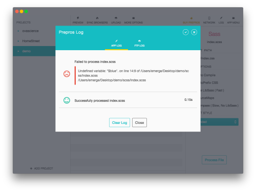
Error logs are presented in a straight forward manner and easy to read.
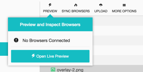
Internal Servers
Task managers are pretty snazzy these days, whatever your weapon is, you can expect to be able to run a synchronized web server wrapper, regardless of the tech stack. This simply takes your development/staging URL, and routes it first through your task manager then to your development or staging URL.
The mini server injects a simple Javascript that lets your task manager refresh the pages when the task manager compiles new code and follows what links you click on.
What this ultimately allows is a developer to have a plethora of browsers and devices connected to a single server URL, and always on the page or view, one is working on.
Previously, Prepros 4 had a huge advantage on Codekit’s internal server management. CodeKit 2 narrowed the gap by offering better internal/external management and page syncing.
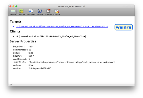
Little has changed for Prepros 5 and it still has the edge over Codekit 2 since it bundles Weinre, a remote web inspector, that allows you to inspect element from a single console on any (modernish) browser that is viewing your website through Prepros. Old Internet Explorers don’t play nice with Weinre.
Prepros however doesn’t do CSS injection still, so any CSS changes require a full page reload which can be painful if working on a slower tech stack.
Prepros 4 vs Prepros 5
Functionality wise, Prepros 4 and Prepros 5 differ very little from each other. The feature sets are next to identical. Prepros did get a spiffy UI update, and it's not just skin deep, as Prepros switched its main engine from GitHub’s Atom to GitHub’s Atom Electron. Mostly all the changes lie within the internal compilers and bugfixes, using much more recent versions. This ensures better compatibility with the current precompiler languages.
Lastly, Prepros 5 switched its Sass compiler engine from the Ruby version to Libsass, a C/C++ port. This translates to much much much faster Sass compiling, and results in real-world speed gains that usually between 300% to 800% faster from my personal experience.
The upgrade was free from Prepros 4 to 5 so there’s little reason for existing users not to upgrade.
Prepros 5 vs CodeKit 2
Easily the #1 advantage Prepros has over Codekit 2 is its availability for Windows. CodeKit is OS X only so that Windows users can skip ahead but my Mac brethren, read on…
Rather than mince words: CodeKit 2 is the better product.
CodeKit offers geekier features such as the ability to use different compiling engines. Was there a new version of LibSass released? Don’t have time to wait for CodeKit 2 to be updated? You can fix that. Need a particular old version of the Coffescript compiler? You can set that up. These seem esoteric but they were life savers when using CodeKit full time. Prepros is fairly regular with updates but you’re also at the mercy of the developer.
CodeKit 2 also has baked in support for Typescript, which Prepros still has yet to offer, although Prepros offers Livescript support.
A short list of features that Prepros lacks and Codekit offers:
Ability to hotkey pause internal server updates
log order management preferences
Syntax Checking
ability to control how CodeKit uses alters for compiles
Optionally bring app to the for front on bad compiles,
Optional menu bar widget,
Git integration
Easier external config files that can be committed into a git branch so other users can stay in sync with the latest Codekit configuration
CodeKit gives budding front end developers much more room to grow, and much more needed flexibility and compatibility.
Prepros vs Grunt
I’ve moved on from using products like CodeKit 2 and Prepros for my daily work. They’re simply not as agile or powerful as using Grunt. Grunt can be chained to do absolutely amazing things, such as SVG minfiication, Visual Regression Testing, and many many many other things. If Prepros or CodeKit can do it, so can tools like Grunt and Gulp, and plenty more.
Both Grunt and Gulp can use BrowserSync. BrowserSync has matured into the best synchronized browser testing utility, beating out CodeKit, GhostLabs, and Prepros, most of which are variants of the same underlying Socket.io tech stack. It can be a beast to configure but offers all the features that CodeKit and Prepros offer, and plenty more.
Windows users have a much higher entry point to using tools like Gulp and Grunt as it requires installing NodeJS and using the NodeJS terminal. There are more hoops to jump through, thus making the bar for entry higher. It’s a bit of mystery how anyone survives using Windows for Front End Development but that’s a subject for another blog post.
Grunt offers a level of power and flexibility that just cannot be found through GUI task managers. GUI task managers have their place, any developer who isn’t writing Sass or Less or Stylus should stop whatever they are doing and buy either Prepros or CodeKit. The benefits are real and tangible.
Setting up projects in Codekit and Prepros require much less work and even as a seasoned grunt user, I miss the simplicity of using such tools. If you’re already using a command line task manager and feel comfortable, there’s no reason to switch to a GUI.
Final Thoughts:
Pros:
Cross Platform
Fast. Uses LibSass by default, faster than Prepros 4 for compiling.
Quick project configuration.
Easy to use, painless.
Internal server includes Weinre.
Built in FTP support.
Live Script support
Cons:
CodeKit 2 is the better product.
Lack of ability to specify the compiler’s version
No TypeScript Support
No Package management
No CSS injection
No Syntax checking
GUI task managers make the entry to front end development easier. Junior developers already have years of tacit skills to catch up on, and probably will make the best use of time learning how to position objects vertically and write manageable large projects as opposed to trying to learn the ins and outs of task managing software like Grunt.
Prepros is a good product. There’s no way not to say that, but it's going against one of the finest pieces of web development software out there. For a time Prepros 4 was the better product, but CodeKit 2 was a massive upgrade that leap frogged past not only Prepros 4 but even Prepros 5.
Mac users should skip Prepros 5 and go for CodeKit 2. Windows users shouldn’t feel burned either. Its quite capable and has a few features that CodeKit 2 doesn’t have… yet.
My wishlist for Prepros 5 is as follows:
External Compiler support, Syntax checking, CSS injection, Bower Package Management, SVG minification, more control for javascript compiling.
I’ve used Prepros 4 professionally and have used Prepros 5 for one client’s project as incidentally its the singular LESS project in our current roster of sites. Prepros is capable but unless something unforeseeable happens, neither CodeKit or Prepros will pry me from Grunt or Gulp.
My iPhone 6 finally stress fractured from a mild bend. I wondered how many days I had before it happened. After rolling 2 years without any case on my iPhone 5, it's a bit clear the iPhone 6 isn’t as durable, and short of an extreme case that the iPhone 6 its plenty more malleable.
What I wouldn’t give for an iPhone 5 form factor with wonders of the guts of the current gen iPhone instead of the nerfed “c” series. I’d consider unretiring my iPhone 5 if I wasn’t spoiled by the massively better camera and the 128 GB storage vs. the 64 GB. I’m certainly in the minority these days, but all I want out of my phone is the smallest form factor, massive storage, and best camera.
I never really had idols but John Stewart was about as close as they come.
I’ve been watching The Daily Show since 1996, and avidly since 2000 after John Stewart took the helm in 1999. It sparked my insatiable thirst for political humor and was no small part of my personal political evolution.
As of writing this, my only regular TV consumption of the past several years has been comprised of The Daily Show, Colbert Report, Real Time with Bill Maher and now Last Week with John Oliver, three of the four were (somewhat) under the Daily Show.
John Stewart was the port in the storm for left-leaning intellectuals during the Bush years. I once got in a heated debate during Thanksgiving back in 2003 with my Uncle, my cousin and his friend Ricky as they watched Bill O'Reilly. As a cornerstone of my debate was John Stewart’s lampooning of Fox News distortion of reality. It sounds trivial today, but calling Bill O’ Reilly puppet in 2003 was essentially labeling myself as ultra-minority of anti-American communist anarcho-socialists who wallowed in self-hatred. It felt being the only sober person in car full of boisterious drunks who wouldn’t let you take the wheel. I much prefer things today to then, and Stewart was one of the key people reframing the debate between left and right.
Its easy to forget what life was like back in the early 2000s post 9/11 (or perhaps for many on Tumblr, impossible to remember) but America waved its civil-rights along with its flags, and political dissent seemed to be underwhelming at best.
That said, John Stewart was always poignant and always amazing.
About two months ago I bought a GoPro Hero 4 Black on a whim as yet-another-way to document my hikes, to compliment my Olympus OM-D E-M5+ M.ZUIKO 12-40mm f/2.8 Pro lens and iPhone 6.
Joe and Katherine pose, Oneonta 2015
I went on a hike in the Columbia Gorge to return to Oneonta falls with friends Joe and Katherine. Words hardly do it justice, so I’ve littered this post with photos from previous hikes. It's an epic short hike down a river. Let me clarify when I say down a river, I mean walking literally in the river, which requires crossing a somewhat dangerous log jam, wading in chest-high water in a slot canyon to arrive at the canyon’s end and river’s headwater, large a waterfall.
David crosses the logjam and treks onward, Oneoneta Gorge 2014
As if the hike isn’t magical enough, the waterfall makes for a great (albeit cold) swimming hole. Its one of those exceptionally rare gems that make Oregon the Pacific Wonderland, and makes for one the most amazing hikes despite its unbecoming ¼ mile length.
Britney jumps, Oneoneta Falls 2014
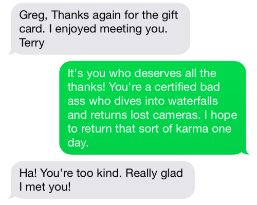
Surprisingly few people jump in into Oneonta. The brave climb along the rock face on either side of the pool and jump, the end pool which is roughly 10-12 feet deep. This is exactly what I did… and what exactly my friend Joe did with my GoPro.
GoPro goes for a dive
We attempted to look for the sunken camera, but without any mask, the dark murky water made it impossible to see. None of the trio, Katherine, Joe or I would be considered accomplished divers, so we left, and Joe offered to pay for another GoPro, all $500 of it to which he transferred me the money immediately via Square Cash.
Every now and again there’s someone that restores your faith in humanity. Two days later, another hiker recovered it, a certified bad-ass retiree named Terry H. who makes a hobby of diving into Oneonta and recovering objects. He’s recovered two other GoPros to date, returning the previous to a girl in Texas.
Upon recovery, Terry e-mailed the photos from the GoPro to friends who then were posted on a popular Oregon Hiker’s group on facebook.
Screencap from the GoPro by Terry
Joe was informed by a coworker that someone found his camera, and he promptly replied. He proved his identity by using the photo at the top of this post. By the end of the next day, I was in touch with Terry whom I organized to meet./p>
Joe and I were both thrilled, Joe wasn’t out the cost of a brand new GoPro, and I got my GoPro back complete with footage. As a way to say thanks, I rode my bike to REI on my lunch break and picked up a gift card on the correct assumption that Terry was some sort of outdoors guru with an affinity for REI. (Really, what hiker doesn’t love REI?)
I met Terry at his house due east of Portland, where he greeted me instantly without a moment of hesitation and was completely friendly. We talked for about twenty minutes about hiking in the Northwest. Terry refused the gift at first, but I pointed out I had written his name on the card, and explained how Joe was equally as grateful as it meant he wasn’t out the money for a GoPro 4 black, Terry accepted. He mentioned he was debating getting a GoPro himself. I assume after fishing a few out of waterfalls/rivers to find them in working order, he’s well aware of their durability.
Lastly, I ordered a floaty for my GoPro from Amazon. Props to GoPro for making a camera that survives waterfalls, and to all the good people who helped Terry locate Joe.
Wired posted a pretty interesting (and negligent) video and article where a hacked Jeep was handed over to a reporter to drive. During the drive the hackers asserted control over the vehicle, blasting music, triggering the wipers/cleaner and even cutting the accelerator all while on driving on an Interstate highway.
I’m not a neo-luddite or even anti-technology, as we constantly improve quality of life but I’m starting to doubt all the benefits in a world where everything has firmware and you’re always being watched.
I was handed a batch of videos from a client’s video shoot recently from a client’s video shoot. MXF (Material exchange format) is a container format much like MOV, AVI and MKV but there’s little info about it. Quicktime derps on it.
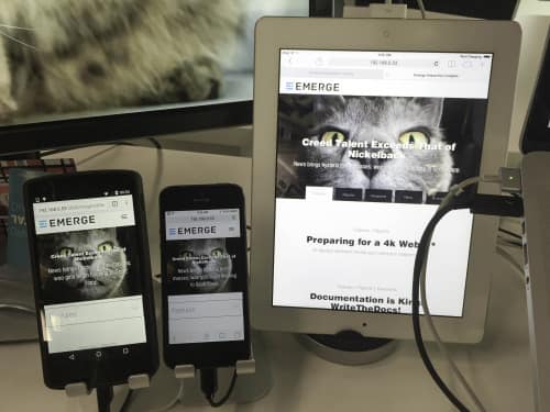
Recently one of my friends asked me what I used for my mobile testing, and I was struck by how few devices I use. Perhaps its a bit of nostalgia but in 2015, the idea of mobile device labs have dried up.
Back in 2012, I’d been very excited to have a setup like one of the messes above, but the wild west days are gone. A few reasons jump to mind:
Mobile is a two party system between iOS and Android (Sorry MS, RIP Palm).
Mobile browsers have matured.
We no longer think in “devices” but screen sizes. Responsive web design solves most screen size issues.
Fragmentation is increasingly less of an issues. iOS adoption rates are impressive. Android grew up and thanks to Chrome swapped to the default browser for most handsets, Android fragmentation is less of a problem for web developers.
Its all about webkit (Sorry Mozilla).
Simulators are fairly accurate for 95% of the time for web development.
The rise of VNC fueled services like BrowserStack enable users to test on edge cases without the need for expensive labs.
Device longevity for phones is still relatively low (when’s the last time you’ve seen an iPhone 4 or Galaxy S1 in the wild or even a iPhone 4S?)
Most devs make effective use of libraries like Modernizr and HeadJS.
Visual Regression testing keeps a finalized design in check.
Quick introduction, Bootstrap Sass is pretty easy to use, and highly recommended as unneeded UI can be commented out in the _boostrap.scss
I’ve compiled a list for quick reference of common vars and media queries. These are located in bootstrap/_variables.scss, these can be changed at roughly line 287. Each root variable $screen-XX defines both the min and max variables, the root vars are depreciated adn media queries should be written with the -min and -max.
$screen-xs = 480px
$screen-sm = 768px
$screen-md = 992px
$screen-lg = 1200px
Depreciated
Note: These can be used instead of screen-xx-min but shouldn’t be.
I wish I made a yearly habit of this, documenting my front end work flow: both hardware and software wise over the years.
Historically its largely been determined by place of my employment. When I worked for a university bookstore, my workflow was pretty basic. I was given sort of AMD WinXP config with Dreamweaver / Photoshop in 2010 followed by some sort of awful energy drink.. My job after that was an 21 inch iMac in 2012 with Coda / Photoshop / VMware / iOS simulator, and with some sort of tea or energy drink.
Over time my workflow has expanded, smaller computer but bigger displays and more devices, and more software and straight coffee has replaced all inferior beverages.
Hardware: ( Pictured Left to right):
27 inch 4k Dell monitor, Nexus 5, iPhone 5, iPad 2, 2013 Retina MacBook Pro 15, 20 inch Viewsonic 1080p, Elgato Thunderbolt 2 Dock, USB 3.0 hub, USB 3.0 HDD, Apple keyboard, Logitech G500.
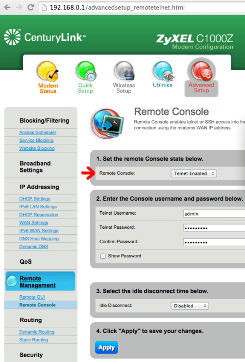
My first DSL modem in 1999 required Telnetting in via serial port to USB. I had to call a network technician at Qwest, and followed by typing in what seemed like arcane commands. I had no idea what I was doing. Things have changed for the better, but most DSL modems still have the ability to log into them directly through command line interfaces. The C1000Z runs BusyBox Linux which comes loaded with your usual base Linux utilities, so if you can wield Bash, you can hack your modem.
Grabbing your PPP username
I was looking to enabled the Transparent Bridge mode for my new Netgear R6050 after a friend managed to break the internal antenna on my Zyxel C1000Z, I wasn’t home so I don’t know the physics involved. Rather than pay $99 to CenturyLink for a new modem/router I decided to buy a new WAP/Router.
Having a little network administration under my belt, I figured I could grab the PPP Password.
The following guide was indispensable and got me 95% of the way there so I suggest checking it out first and/or following it along with my more “For Dummies” guide:
You’ll want a basic understanding of SSH and/or Telnet. OS X regardless of version come with SSH and Telnet as does (almost) every flavor of Linux. Windows users will need Putty.
Step 1:
First you’ll need to enable telnet in your Router, and you’ll need PPPoe enabled (Under WAN settings), these can easily be done through the Modem’s GUI
Step 2:
Fire up your terminal (Windows users will have to use Putty, and translate the instruction) and type:
telnet YOUR-IP-ADRRESS
In this example, my router’s IP address is 192.168.0.1, this is the default address so I would type:
telnet 192.168.0.1
It make take a moment for the router to respond, once it does, respond something like “BCM963268 Broadband Router” and it should ask for your username, type in the username you entered hit return and it should then ask for your password, enter the password you typed in, hit return.
Step 3:
Using the terminal we can call all the active tasks running on the modem, to do so type:
ps
Geek stuff: Users can use sh to access the BusyBox linux Bash shell and run task monitoring software like top. If you’re feeling adventurous, type sh and poke around using commands like ls and top. You can grab the process ID using top just like we do in step 4.
Step 4:
You should see a long list of responses, that read:
PID USER VSZ STAT COMMAND
1 admin 1556 S init
2 admin 0 SW< [kthreadd] 3
admin 0 SW< [migration/0]
4 admin 0 SW [sirq-high/0]
and so on... We’re only interested in one entry, the one that’s running the pppd (or ppp*) command. it’ll probably be at the bottom. It should read something like:
The password portion of this is encoded, the tricky part here is identifying it. We know the that this is a concatenated line by gauging from the previous line. The password portion should be between -p and -. In this example, the encoded password is:
jlFrVNtRMtU=
Step 6:
This password is encoded in base64, thanks to the leg work Make a new tab or new terminal window, and type:
echo "jlFrVNtRMtU=" | base64 --decode
It should spit back something like:
ac7gkDnUmac-pro:~ user$
the ac7gkDnU will be your PPP password. Congrats! You’re now ready to enable transparent bridge mode on your router.
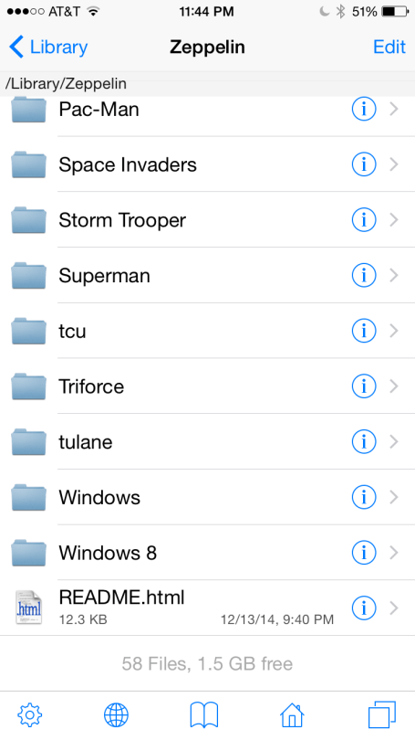
Zeppelin is a custom carrier icon jailbreak application, and when combined with iFile, it only takes a few minutes to create your own carrier icons.
All of Zeppelin’s icons are located /Library/Zeppelin (using iFile). Also notable is the README.html located in the same directly which contains all the specs for custom Zeppelin icons, which are all listed here.
Most guides recommend a plethora of icon names and sizes but most pertain to old iOS versions. As of iOS 7, only three styles matter.
Step 1: Creating the icons
For iOS 7 and iOS 8 (tested on iOS 8.4), you’ll need to create three separate icon styles at three sizes for a total of nine icons. Here’s a quick run-down of the three styles:
logo - black silhouetted logo (free of whitespace). This is used by Zeppelin to color accordingly.
dark - this is used when the statusbar icons are dark. It can use any combination of colors.
light - this is used when the statusbar icons are dark. It can use any combination of colors.
Each icon needs three separate sizes for varying densities, standard, 2x and 3x sizes. The height is the most important if the size height is incorrect, you may see icon flashing on screen transitions. The sizes are as follows: 40px by 16px , 80px by 32px @2x, and 120px by 48px @3x.
So for a working set of Zeppelin icons you’ll need to create a total of nine icons:
logo.png - black silhouetted logo. 40px (max width) x 16px.
logo@2x.png - 80px (max width) x 32px.
logo@3x.png - 120px (max width) x 48px
dark.png - show on dark toolbar, 40px (max width) x 16px.
dark@2x.png - 80px (max width) x 32px.
dark@3x.png - 120px (max width) x 48px
light.png - show on light toolbar, 40px (max width) x 16px.
light@2x.png - 80px (max width) x 32px.
light@3x.png - 120px (max width) x 48px
For this example, I created an based off of University of Oregon’s O logo, you can download my icon set here (click download zip on the lower right hand corner).
Step 2: Launch iFile and go to Library/Zeppelin.
Step 3: Create a new folder for your new icon.
Click Edit in upper right hand corner and click the + symbol.
Name your icon whatever you’d like, all the default iFile attributes and ownerships should be correct.
Step 4: Start up iFile and click the web server (the globe icon).
Plug the IP address that ifile reports into your web browser on your desktop computer (In this example its 192.168.0:103:10000), and navigate to Library/Zeppelin/[YOUR FOLDER] and upload your set of 9 PNGs.
Step 5: Close iFile’s webserver and go to your iPhone’s Settings -> Zeppelin
Step 6: Select your custom icon under your theme menu!
This means that if you’ve matched your library with Apple Music and iCloud Music Library, you need to keep backups of your original files. If not, you’ll end up with files that you can’t play without an Apple Music subscription.
So think carefully if you plan to use iCloud Music Library.
Match doesn’t exist separately. Instead, Apple Music gobbles up your iTunes Match library. I’m sure there are some users who don’t care, but your music library is held hostage for eternity even if you bought it elsewhere (if you delete or lose your DRM free originals).
With reports of playlists being munched and the service crashing, Apple Music has been anything but smooth.


 David crosses the logjam and treks onward, Oneoneta Gorge 2014