-
Beyerdynamic DT-770 / DT-880 / DT-990 Removable Cable Mod
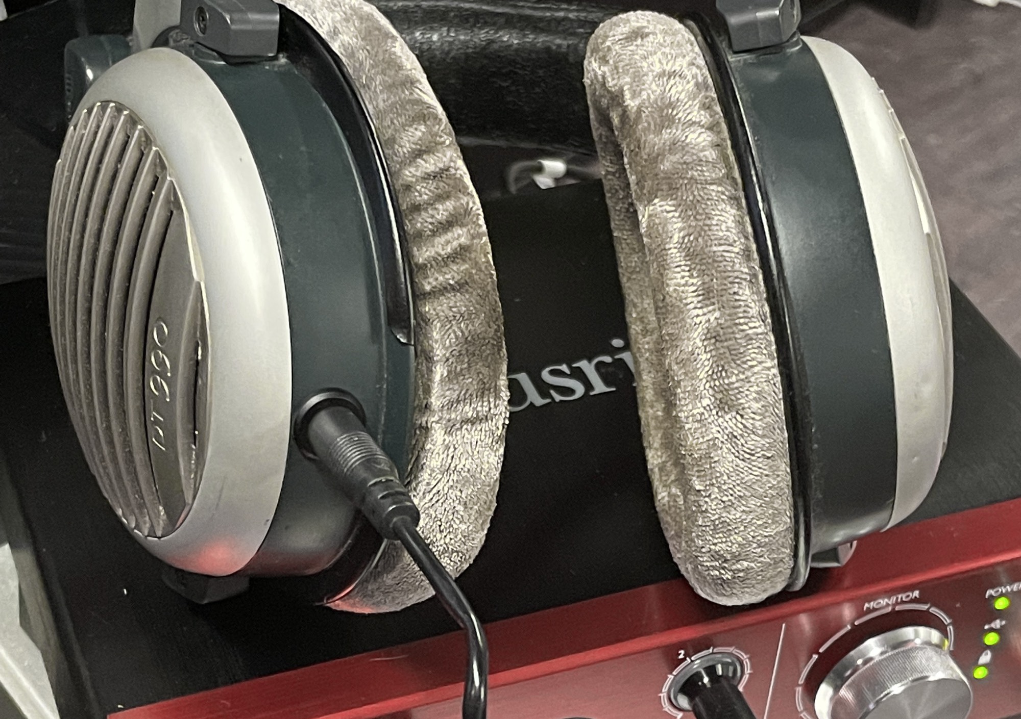
I have a confession to make. I'm absolutely terrible with a soldering iron. When my 600 Ohm DT-990s cable went bad, I was able to fix it and knew I was more likely to damage my headphones than fix them. It's been a long-standing complaint that the high-end Beyerdynamic design has a hardwired cable, whereas many other high-end makes have detachable cables.
I tried looking locally and called a few audio shops, but none did repairs. Then I discovered a guy on Etsy who specialized in a detachable cable modification. I forgot about it until December when I was on Etsy, doing a bulk of my Christmas shopping, and decided to take the $75 plunge as it'd not only fix but improve my favorite pair of headphones I own. I could write quite a bit about my thoughts about the DT-990s, but the fact is if you're interested in this, you already own a pair.
I also did a video version of this blog post.
I have to say, I'm genuinely impressed with the headphones. Matt of demevalos, was responsive, even during the holidays when surely he had better things to be doing, and the turn around wasn't bad considering the massive log jam that is the USPS among holiday rush and defunding.
As far as changes to the headphone's quality, there's no introduced noise or degradation to the signal, granted my headphones have been out of commission for months so. They're as good as I remember. They're the same crisp, slightly overly bright, articulate, tightly coiled, deeply responsive bass.
Demevalos also does balanced cables for the DT-770s, DT-880s, and DT-990s and the 1770s/1990s. Besides being spending and correcting a design failure on Beyerdynamic's end, I have to say I highly recommend this mod.
-
A Threat To Democracy Part II
As much as I want to ditch my cynicism and write something unrelated to current events, the actions that stunned the world yesterday seemed all too predictable. There were some truly amazing photos, like the humorous, self-paradoxical, woman waving a flag of herself waving a flag or the blood boiling, traitor flag being paraded through the capitol.
The greater irony is these actions were agitated by Donald Trump, Rudy Giuliani, and for months if not years. I'm unsure how we proceed from here as we've politicized reality. Nearly as quickly, despite all the evidence, the right-wing blamed Antifa and Black Lives Matter, and when inevitably the political affiliations of the rioters who were arrested are revealed, they'll claim either a cover-up, or some deeper conspiracy. At least there's some humor to be found in the irony that their anti-mask beliefs are making it easy for them to be identified.
If you asked me 4.5 years ago my biggest concerns, it'd been something like "healthcare access and reform" or "the environment". It's now been reduced to protecting democracy, hardening institutions of voting, and free and fair elections. The Democrats better not squander their chance to harder the guardrails of democracy.
I still earnestly believe we can deescalate a little, and dial down the tone over the next four years, but it won't be easy.
-
CyberPunk 2077 is now playable on a classic Mac Pro

When CyberPunk 2077 launched, it required AVX, a set of CPU instructions not found on any classic Mac Pro. Clever hackers had removed the requirement for steam and, GOG distributions. In a show of how fast things move, while writing this blog post version, 1.05 was released, which now removes AVX requirements from CyberPunk, effectively mooting the tutorial I had planned.
CyberPunk 2077 surprisingly runs fine on older hardware long as you have a beefy GPU. Due to limited macOS support for GPUs, the best GPUs supported by both macOS and Windows 10 for gaming currently are the Radeon VII and 5700 Xt, neither of which pack enough muscle to play at 4k with maximum settings. That said, nearly maxed 1440p is totally achievable (I only disabled motion blur as, for some reason, I find it bothers my eyes and lowered texture filtering and volumetric shading too high). If you lower settings further, higher resolutions are available. Like most games, the limiting factor is the GPU. Users with lesser GPUs like RX580 should expect acceptable framerates 1080p with reduced settings.
Step 1: Update your GPU drivers to the latest
AMD released specifically for CyberPunk 2077 a GPU update, version 20.12.1 (or greater). These can be downloaded via the Windows AMD Control panel or via their website.
If you don't, the game will likily crash after the create a character screen.
Step 2: Make sure you're running CyberPunk 1.05 or later
Next, make sure you've updated before starting. Otherwise, the game will generally crash after the prologue.
In my limited testing, the game runs perfectly fine on my Mac Pro without any (additional) glitches.
-
Life with the MacBook Air M1 from a web developer
Last week I received my MacBook Air (16 GB/1TB). It's the first brand new computer I've bought personally in 12 years, the latest being the 2008 Mac Pro. I've had a slew of work provided MacBook Pro 15 inchers, 2013/2015/2017 (current), and my main desktop is still a 12-Core 2010 Mac Pro with Radeon VII 3 SSDs and 96 GBs of RAM, so these are going to be my comparison points. I've seen many benchmarks but less about what it's like to be a developer with one.
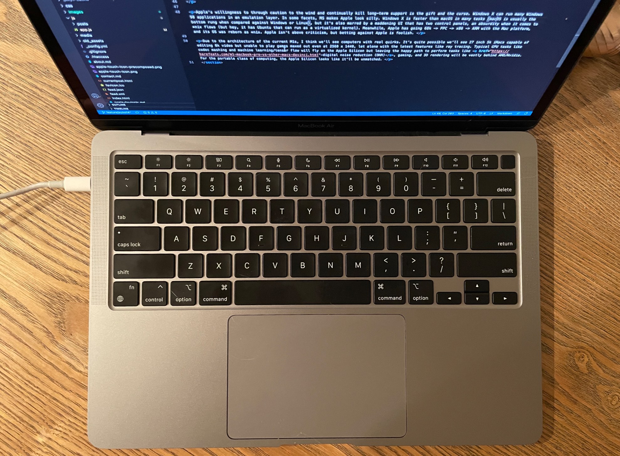
It's fast in very unconventional ways, resizing the resolution doesn't even flash, and it wakes instantly and unlocks fast in a way my work MacBook Pro 15 inch 2017 doesn't. It's also fanless, which is just outright incredible. It's, of course, dead silent. The last computer I had that didn't have a CPU fan was a G4.
I have to mention the keyboard. It's really ridiculous that we should talk about keyboards at all on a luxury brand like Apple. For years Apple had the best laptop keyboards of any make, then from 2016-2019 changed to the dreaded butterfly keyboard (which caused horror stories of individual keys failing) and added the horrible touchbar as an additional insult. I would have paid extra not to have the Touchbar. The MacBook Pro has the Touchbar (along with slightly better mics and speakers, a fan, and larger). The MacBook Air does not. The typing experience is much better than my MacBook 2017 and reminds me of my 2013 and 2015 MacBooks.
Development is a bit clunky. Homebrew requires prepending everything with
arch -x86_64to use the Intel binaries as Homebrew is barely alpha for Apple Silicon. NodeJS is Intel. NVM is Intel. Ruby via Homebrew is Intel (ruby comes preinstalled, but if you want to use pain-free global packages, you'll be using the homebrew version). Git is Intel. Webpack is Intel. Android Studio is Intel, but the emulator is ARM native. WebStorm is Intel. There are a few like BBedit and VSCode that have dual binaries. It feels fast, but due to the amount of Rosetta 2 binaries, not nearly as much so. Speedy but not so much more than my 2017. I've yet to try Docker as it was just released.Firefox on the m1 is as fast I've ever seen time-to-paint and JS execution. It's really fast. It didn't even blink when I loaded up a TweenMax animation I made with a complex SVG with thousands of polygons that kicked my 2017 into leaf blower. The M1 absolutely shines surfing the web as it's incredibly fast. It's the fastest I've experienced. I do not say this lightly as a significant part of my professional life has been coding web pages/web apps to render quickly.
Apple Motion performance is a bit of a grab bag. It certainly does well for an ultra-light laptop, but if you're working with big ass PSDs, multi-video clips, and so on? The RAM and middling GPU performance show, whereas codec mashing is pretty impressive. The M1 with Pixelmator's ML functions smoke my MacBook Pro badly. 16 GB of RAM is still 16 GB of RAM. Rendering to RAM is still as constrained as my MacBook Pro.
Unified Architecture
The M1 isn't just a CPU as it includes the GPU, and the neural network cores, image signal processor (ISP), an NVMe storage controller, Thunderbolt 4 controllers, and a secure enclave coprocessor. The M1 is a SOC. The CPU itself has four high-performance Firestorm cores and four energy-efficient Icestorm cores. Rather than paraphrase, it's best to quote Wikipedia for the following:
The high-performance cores have 192 KB of L1 instruction cache and 128 KB of L1 data cache and share a 12 MB L2 cache; the energy-efficient cores have a 128 KB L1 instruction cache, 64 KB L1 data cache, and a shared 4 MB L2 cache. The Icestorm "E cluster" has a frequency of 0.6–2.064 GHz and a maximum power consumption of 1.3 W. The Firestorm "P cluster" has a frequency of 0.6–3.204 GHz and a maximum power consumption of 13.8 W - Wikipedia: Apple M1
We've come a long way in dynamic frequency scaling since the Pentium M (one of the first widely available CPUs with the ability to adjust its frequency). Dynamic frequency scaling allows a CPU to change its own clock speed based on how much stress the CPU is under in order to save power. Every Intel Mac made has this ability. The M1's CPU clock speed ranges from 600 MHz - 3.2 GHz in the high-performance cores and 600 MHz to 2.064 GHz in the low power cores. It's quite a range.
The hype train about the M1 and RAM being different is being misrepresented. Unified memory means the GPU and CPU share the same memory, reducing the latency of caching data into the RAM to then be transferred to VRAM. Both the GPU and CPU have access to the same pool, thus speeding up the process. This comes at the cost of not having a separate VRAM buffer, which can be used independently for parallel processing/render buffers, as well as the more "typical" functions like caching textures. Unified memory architecture isn't new as game consoles for decades have used it to great benefit. It's one of the reasons why a seemingly underspeced console like Xbox 360 with only 512 MB of RAM was able to effortlessly produce HD graphics in 2005 below the cost of a single GeForce FX 5950 Ultra. I suspect a good deal of users over-estimate their RAM usage as memory pressure in modern macOS is far more indicative of RAM performance than memory usage. macOS since 10.9 Mavericks uses RAM compression, which the M1 architecture fully embraces. Also, modern OSes intelligently cache less accessed memory spaces to disk buffer. Combined the previous with the speed of NVMe SSDs, virtual memory isn't nearly the speed hit. While I'll routinely stress my MacBook Pro 2017 with its 16 GB of RAM, it usually does pretty well with a large suite of utilities (I'd like more, of course, as it'd speed things up. In the era of M1 Macs, RAM is just as important as it ever was regardless of what MacWorld says, as it's now doubling as your VRAM too.
I can certainly see a future where none of the Macs feature upgradable RAM thanks to unified memory (unless engineering allows otherwise). This feels especially problematic at the pro level, a Mac Pro 2009 can use 128 GBs of RAM, and Apple has only produced a grand total of 4 computers since then that can use more than 64 GBs of RAM (the Mac Pro 2010, 2013, and 2019 and the iMac Pro). There's certainly going to be some resistance to paying upfront, especially when some edge cases users are thinking hundreds of gigabytes if not a terabyte of RAM. The benefits might be outweighed by the sticker-shock of a machine that's performance locked as there will be no RAM or GPU upgrades. Whereas on the PC side of things, you'll be able to offset the cost by waiting to upgrade. Sure, it might not be as fast out of the box, but in two years, you won't need to buy a new computer to achieve modern GPU performance. This alone is places Apple Silicon takes its speed advantage at an economic disadvantage.
The question is, "How will this calculate?" The only way this math makes sense is when buying computers that already face this issue like laptops (where upgrade options are sparse if available at all), or you believe Apple will be so far ahead of the curve that the issue becomes moot. Apple already drove en mass the VFX and a large chunk of the video world away from Apple with it's double-fault of the tandem releases of the 2013 Mac Pro and Final Cut Pro X, and later a childish feud with NVidia. While I doubt it'll be near as a dramatic shift, I can see a future where Hollywood further pivots from Apple. Hopefully, Apple will allow discrete GPUs along with its own GPU cores as Nvidia and AMD wildly ahead of Apple and not slowing down for them to catch up.
Back to the M1, the video output is pretty disappointing as it can only drive one external monitor. The GPU does what it needs to do and works well in video editing and codec mashing but less so elsewhere. I imagine that this is probably enough for most people, but I am not most users. I used two 4k monitors (32-inch + 43-inch) plus my 15-inch display on my MacBook Pro for work. Fortunately, I knew this limitation going in, but it is pretty pitiful considering the Intel MacBook Pro 13 can drive two 4k Monitors at 60 Hz, and the 2019 MacBook Pro can do four 4k displays at 60 Hz. The GPU is pretty weak sauce for gaming. It's better than the Intel integrated GPUs, which isn't exactly something to brag about.
A few Mac publications gleefully posted that the M1's GPU's performance is that of an Nvidia GeForce GTX 1050 Ti, an ultra-budget GPU released in 2016 with an MSRP $109 at launch. They also compare it to the RX560 and mention that it requires 75w. That's true for the desktop version, but it has a mobile version that does not draw 75 watts. It is found in the MacBook Pro 2017s and can drive three external monitors, and incidentally will produce higher framerates in games in Windows than the M1 can in macOS. All that nerdage aside, the 13 inch Apple laptops have never had dedicated GPUs, so this is a welcome upgrade but not an eyebrow-raising one and strangely limited with external displays.
Battery revolution?
That 16-hour battery life? Ha, no. Not when doing development. It seems like I could make it more than the 2-3 hours my 2017 does but more like 4-5 hours. I imagine when we see more M1 binaries, this will improve, but the constant disk swapping for memory is always going to be a battery cost. Right now, a bulk of the toolchain is Intel. I assume this is a bigger battery hit. I also noticed when trying SourceTree, and my battery was being zapped. Perhaps this is a temporary state thanks to the x86 emulation, but ARM's supposed battery magic seems less exciting if your eyes have wandered to the PC market as of late. PC makes are routinely advertising 15-hour batteries at lower price points than the MacBook Air and surprisingly at similar weights. I cannot attest how accurate they are, but it is surprisingly combing Costco to see laptops serving up solid machines at $800 with 512 GB NVMe SSDs and 16 GB of RAM with late gen Intel or the newly minted AMD chipsets, all with the battery life associated with the M1, nearly half the price of the M1 with the same RAM/storage. ARM isn't going to be the extreme battery life extension that some had hoped, but the M1 firmly puts it at the top of the pack in laptops.
Yes, you can still install whatever apps you like
There's a lot of misinformation about the M1 and Apple lock boxing it. I can assure you it's not what you think it is. See the screenshot below.
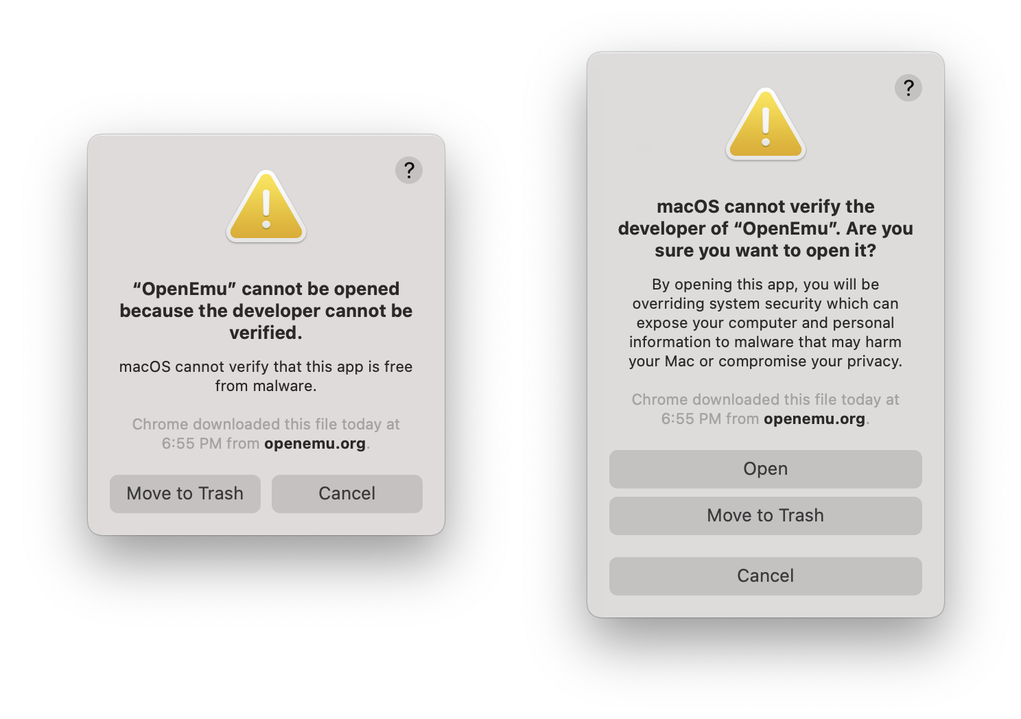
Left: the warning users will receive without right-clicking open. Right: warning message when right-clicking/option clicking bypass
Not condoning it, but if you really fear the inability to run illicit software, yes, you can do that, even Apple binaries. I've also run unsigned x86 code. SourceTree and OpenEmu both gave me spooky warnings, but I was able to run them after right-clicking. The fear-mongering is just that.
So how does it compare to my Mac Pro? Mostly faster with just a few asterisks. Even my 2017 MacBook Pro is often quicker in many tasks since a lot of web development (javascript) is so single core tied. Anything Node uses a single core per instance. The Mac Pro, though, still is my preferred box, but as my first new computer purchased for myself (I've had a flurry of work 15 inch MacBook Pros: 2013, 2015, 2017) since my 2008 Mac Pro, it's a damn fine computer.
iOS Applications and macOS
Running iOS apps is next to worthless. I thought it'd be nice to have a dedicated HBO Max app, but you cannot scale the app windows. When I tried to download Slack just to compare iOS vs. the shitty Electron app, I couldn't find it. It turns out it's listed as incompatible Same went for Gmail. You need to pull the IPA off your iPhone or iPad with a utility like iMazaing. Annoyingly, I do not have an iPad, so I cannot compare Slack's experience via Electron vs. native. The use cases seem pretty narrow, but perhaps with some hardware that that iOS only via Bluetooth, it'd work via the laptop. Apple's love and affection often seem too focused on the iPad Pro. It's a device that's not terribly compelling to most professionals as everything in its workflow is a compromise and functions as a spiffy niche device. However, the possibility of dual-booting to macOS or at least entering a "Finder" app when a keyboard with a trackpad is plugged means Apple could, in theory, make the iPad Pro a Mac. I'd be very surprised if Apple isn't playing with this idea. To date, I haven't seen this intuitive leap made by anyone other than me, but I cannot be the only one. I also can see the other side of the coin where Apple fears cannibalizing the near-non-existent pro app market on the iPad.
What about Windows?
Windows does have an ARM build, and with a Rosetta-like translation layer that currently only supports Win32 binaries (not 64-bit). That will certainly change as Microsoft has the technical chops. Apple's official policy has been "Really up to Microsoft." I highly recommend reading the linked article. Thus far, there isn't a way to run Windows natively but you virtually run Windows via Qemu. The performance is impressive.
I can't say if Redmond will move to make Windows ARM run on the Apple Silicon, but Apple doesn't seem like it'll be adversarial. There's still a question if Windows will include proper drivers for the ML engine (or if Apple would be game to at least provide support) and GPU but it seems promising. Fingers crossed, we'll see a return to dual-booting Macs or at least ultra-high quality offerings from either VMware or Parallels.
Final Thoughts
For most people, this is the laptop you want unless you're a professional. I would not have bought this as my primary work computer due to the software hurdles of being an early adopter and some of the hardware limitations (lack of video out beyond a single display, and only 16 GB of RAM). I don't regret it as I was heavily considering buying a MacBook Air for travel last year when we could do such things, but we're gonna see some monstrous CPU performance when the M1X (or M2) hits the shelves in the MacBook 16 inch. That said, there's a bit of an asterisk. It's unclear if we'll see nearly the year-over-year gains once Apple ratchets up its core count. Right now, we see the whiplash of a new architecture. Apple's year-over-year performance on the iPhone has been breakneck so there's no reason to assume the Macs won't be the same. I expect Apple to be the leader in portable performance but desktops? Not really. AMD has Zen 3 due out in 2021 with bold claims of 50% improvement on processing power to watt efficiency and then early 2022, Zen 4, again boasting another 50% improvement on processing power to watt efficiency on a 5nm die with PCIe 5.0 bringing a 16x PCIe slot to 64 Gigabytes (512 Gbps). AMD already has today in 2020, 128- Core Epyc CPUs. Brute has its merits too.
If I sound a bit negative, over the years, I've learned is my deep-seated skepticism generally doubles as the closest thing I have to intuition. The Apple MacBook Air M1 is impressive, especially in the class of laptops without dedicated discrete GPUs. Its single-core performance is so good (as is Rosetta 2) that running x86 is often faster than other Intel Macs, and native applications are even faster. macOS feels less pokey on an M1. Thanks to years of optimizations in the iOS arena for things like javascript, Apple Silicon is incredibly fast. In some ways, it's the fastest computer Apple makes, which is mind-boggling. In others? Not nearly as much so. Most pros probably should hold off as too many tools are x86 or using less-stable nightly builds or, worse, not working (audio apps are hit especially hard). Everyday users, though, will find the M1 incredibly zippy, especially if coming from several-year-old computers.
Apple's willingness to through caution to the wind and continually kill long-term support is the gift and the curse. Windows X can run many Windows 98 applications in an emulation layer. Windows X finally stopped distributing a 32-bit version of it's OS. Apple won't even support 32-bit binaries. MS's support now ranges in the decades for a considerable amount of software and hardware. In some facets, MS makes Apple look silly. The supposed bloated Windows X is faster> than macOS in many tasks (macOS is usually the bottom rung when compared against Windows or Linux), but it's also marred by a maddening UI that has two control panels, an absurdity when it comes to *nix flows (but hey, it has Ubuntu that can run as a virtualized kernel). Meanwhile, Apple has going 68k -> PPC -> x86 -> ARM with the Mac platform, and two OSes (as Mac OS 7-9 and OSX/macOS are effectively two separate operating systems). Apple isn't above criticism, but betting against Apple is foolish.
Due to the architecture of the current M1s, I think we'll see computers with real quirks. It's quite possible we'll see 27 inch 5k iMacs capable of editing 8k video but unable to play games maxed out even at 2560 x 1440 or connect to more than two external displays, let alone with the latest features like ray tracing. Typical GPU tasks like codec mashing and machine learning/tensor flow will fly on the Apple Silicon but leaving the happy path to perform tasks like digital noise reduction (DNR), gaming, and 3D rendering will be vastly behind AMD/Nvidia. ARM doesn't implicitly mean non-modular, SOC only, as we've already seen. For the portable class of computing, the Apple Silicon looks like it'll be unmatched (and expensive). Brute Force vs efficiency will be the story of x86 versus Apple Silicon versus ARM, and I suspect there won't always be a clear winner.
Welcome to the next decade of computing.
-
Blog Upgrade
This is my first post from the first new computer, a MacBook Air M1, that I have bought personally since 2008, a Mac Pro. I've owned a flurry of work laptops MacBook Pro 15 inchers from 2013, 2015 and currently, a 2017, and I bought a 2010 Mac Pro a few years back. I haven't had my own personal laptop since 2013.
I finally updated to Jekyll 4 which was annoying as I had to upgrade pagination. I think I've finally hit a place where I've outgrown Jekyll for blogging software. There's some new static site generators that look a bit nicer, as I still write my posts by hand in HTML as if it were 1994. I can write HTML in my sleep (and probably have) but it detracts from writing. If there's any general weirdness on the blog, its due to the upgrade even if I'm still content with my hyper minimalist presentation.
Update: what a pain in the ass Jekyll is, the old parser for Markdown isn't supported, but the majority of my post are actually HTML. My previous parser literally spit out whatever was HTML content, whereas this one processes the HTML. This doesn't do anything besides actually cause a lot of problems if you have any HTML errors like a mission " or an improperly closed tag. Thus, a few pages were borked requiring me to go through and try and find the HTML misrenders. I think I got almost all of them but I think my days with Jekyll are coming to an end. I started this blog on Tumblr (mistake) and moved to something I could control in 2016 as it was clear not owning the platform I was on was a negative, and I completely misunderstood Tumblr by actually blogging on it. It in hindsight, it was absolutely the correct move as a closed platform meant I was subject to the whims of the owners, and even better, the hardened SEO has meant I've had much better SEO even if my SEO strategy is entirely anti-SEO beyond accessibility.
I've never gotten my FTP process to automate so I still use FileZilla and I write in HTML. Newer frameworks exist. Right now I'm leaning towards a React based system that renders a static site long as it can be used even when JS is disabled, adds very little in payload (my blog is insanely light weight with a payload 11k of CSS, 90k of JS (mostly jQuery, time to move on there) and roughly 10k of HTML for many posts.
-
iPhone 12 Pro & iOS 14 reactions
In the past, I've recorded my thoughts when I've purchased a new phone with my iPhone XS & iOS 12 impressions and Initial Reactions to the iPhone 7 . It's interesting to see any predictions I make either come true (3rd camera lens) or burn in flames (force touch).
Since there are far better reviews on the web of the iPhone than what you'll find here, I've instead opted to record just my initial reactions thoughts after 2+ weeks.
- Getting my phone past first boot took roughly a halfhour, but getting all my applications and photo previews took pretty much the entire day. Ugh.
- I still miss the headphone jack.
- At first, MagSafe seemed cool, but seeing the real-world applications, I've yet to purchase a single accessory that uses it. I don't see myself doing that any time soon.
- LThe lightning port needs to die in this USBc world. It served its purpose as a big upgrade over the other USB formats of its conception for usability, but USBc solves it and is widely used by everyone, including Apple. It feels more and more like a cash grab.
- The iPhone 12 Pro needs a mini version. I'd love that. The iPhone 5 remains the greatest iPhone design for size/weight to screen.
- The iPhone 12's hard edges are so much better. It's a return to the iPhone 4 and 5. I imagine we'd seesaw between round and hard edges in 5-year cycles until the iPhone's death as a way to shift the look and feel between generations.
- Apple's premium phones feel fragile still. It's less so than the XS, but a case feels required.
- There's a noticeable increase in sharpness that I didn't expect over the iPhone XS. Photos look as good as ever but still not as sharp as any DSLR with even mediocre glass. It's all about the physical surface area of the sensor to capture those photons.
- The iPhone 12 Pro's cameras big improvements over the 11 seem to be software that feels a bit spiteful of the hardware.
- II didn't expect to notice the speed increase over the XS, as even with my iPhone 7, the performance had hit "fast enough." A lot of it appears to be the 6 GB of RAM. Apps rarely reload. I wish they'd just ripped the bandaid off and gone with 8 GB for a bit more future proofing, but I suppose they need something to upgrade in 2 years. While I'll certainly be wrong, in the iPhone's constricted form factor, I doubt we'll be asking for 16 GB of RAM in 2022.
- The CPU upgrade shows in exporting vids. It's noticeably faster over my XS.
- The Wide-angle is pretty useful. I wish we'd finally get a quad lens setup with 0.5x/1x/2x/4x as that'd be 13mm, 26mm, 52mm, 78mm, or perhaps 0.5x/1x/2.5x/5x for 13mm, 26mm, 65mm, 130mm as that'd cover the bases for standard photography. Reviewers complaining about the lack of increase are missing the fact that a tiny phone with a huge optical zoom stretches the limits of handheld photography. A 2x is far more useful as 52mm is close to the stand by considered the "human" lens (although eyes are not cameras). A 78mm would be near the photojournalist 85mm "portrait" lens, which does wonders for outdoors with its compressed Z access.
- Night mode works fairly well but doesn't work miracles. It's a massive improvement over my XS and bound to be improved upon each generation (mostly through software).
iOS 14
- iOS 14 was problematic for health data and required a reinstall on the phone to work properly with my XS. Stupid
- Widgets are overhyped, but users love them apparently. I'm not big into customizing my phone. I run it in dark mode and reduced motion to conserve battery life, and I have the same lock screen as the iPhone 5 and the same background as my iPhone 7. Wigets far best used on the widgets screen. Polluting my home screen doesn't do much for me. There's not a lot of data I need every single time I look at my phone. On the widgets screen, I've added the battery life.
- I wanted smart folders but this implimentation? It sucks.
- App organization is still god awful. Folders are artificially small. They do not have custom icons, and they can't do folders in folders. Also, why can't we vertically scroll on-screen like Android? iOS 14 failed to deliver much meaningful change.
- Am I alone that Memoji is tacky? I'm probably an island of one here.
- Small Siri is nice, but I liked seeing what my phone interpreted my voice commands as real-time instead of waiting and seeing.
- Picture-in-picture mode is probably great on an iPad, but it doesn't feel very meaningful on my phone.
- Translate looks cool, but I can't travel now because, y'know...
- Apple sign-on is great.
Things I was wrong about
- FaceID: It's overall an improvement over Touch ID and lateral than I thought it'd be.... but now we all wear masks.
- I wasn't willing to ditch the larger phone format with dual cameras. Now I want three. If they add a forth, I'll want that too.
- I regretted not getting 512 GB of storage.
-
The day after

Pictured: friendly debate with people from my home town. I hearted this post. This is gonna be a really awkward Thanksgiving for a lot of Americans and I'm thankful my immediate family is who they are.
This made me chuckle, as my heart is filled mostly with irony but we have 70 million voters who potentially share this world view. Even thinking fractionally, that's a frighteningly large number of people who are "angry, spoiled, racially resentful, aggrieved, and willing to die rather than ever admit that they were wrong". I can't say I wasn't above gloating, just a little after repeated attacks on the democratic process from a failed real estate agent $1,000,000,000 in debt. My team won (better than it felt), but we have a lot of work to do.
I don't hold any greater hope that we can fix everything or convert many to our egalitarian outlook; a worldview that places more value on assisting those in need, the environment, science and education. Just maybe we can deescalate a little, and dial down the tone over the next four years. Outside of hottest-take-wins Twitterati warriors of this world, I think the vast majority people, here and also abroad would appreciate a little more civility... and a little less conspiracy.
-
All .dev URLs return Unknown Host Error in macOS (OS X)
So... I discovered a strange problem, any website using a
.devsuffix would give me an unknown host error. First I figured it was my DNS, swapping servers and clearing the DNS cache, trying my VPN etc which didn't work. Pinging any .dev URL would return pings absurdly low responses suggesting somewhere something was routing all requests to local/127.0.0.1.Checking my
etc/hostswas a bust as well as Apache's vhosts. After about a half hour of reading I found the following thread, Pinging test.dev after Laravel Valet install returns "Unknown Host" .Posters mentioned dnsmasq utility. To fix the problem, users used brew (OS X package manager) reinstall/restart it. Being semi-familiar with brew, I used Brew's list command. I found that I indeed had it installed. I tried the perscribed method which didn't work but I felt like I was on the right path.
Not giving up, I dug up the
dnsmasq.conffile located inusr/local/etcand noticed a single entry,address=/.dev/127.0.0.1. I deleted it and after a reboot, every thing was back to normal.
-
Cme Xkey 37 Le Review
---
layout: post
title: "CME Xkey 37 LE Review"
date: 2020-12-15
categories: front end development
tags: [front end development]
---
Earlier this year my old reliable first edition Korg MicroKey 37 died, after 7 years of service. I've bought multiple midi keyboards including a 88 key hammer action weighed keyboard which I quickly discovered was far too big for my use case. Since then, I've favored the 37 key for my sometimes music production mostly for the size and for the selection as there happens to be a bit more options at the 37 size over the more practical 49 keys.
With 2020 being what it is, I've revisited my audio studio setup and decided to buckle down and actually learn to play the keyboard. I had bought the current microKey only to discover... I hate slim-width keys while trying to actually play anything.
The search for the ideal 37 key
Searching for high end small keyboards is a bit of an oxymoron. Here's my observations:
- The most expensive keyboards in the 49 and below form factor generally pack in "gee-wiz" features, pads, knobs and sliders. These are nice but drastically get away from my "small-as-possible" ideal. I also have an Ableton Push 2 and a NI Maschine MK II which are far more capable in the pad/knob department.
- Weighed/Hammer Action Weighted keyboards simply do not exist sub 61 key. There's a few 49 semi-weighed keybaords like the Akai MPK249, which falls into the "gee-wiz" style, and certainly isn't small. 37 semi-weighed keyboards are pretty much nonexistent.
- Most of the keyboards designed for travel use slim keys.
This meant I had to reset my expectations, once I did I zeroed in on the CME Xkey 37.
Low Travel / High quality
weThe Xkey is its own beast in a number of ways. First off, it's an aluminum chasis, which immediately sets it apart. After years of cheap midi keyboards, it doesn't feel frail but rather substantial. Next up is the lack of a standard pitch-bend/mod wheel. Instead, they're replaced with touch sensitive pads. Also, it's absent of a sustain pedal, instead featuring a sustain button, which is a mild disappointment but not a fail like the original Korg Microkey 37 which did not feature a sustain pedal at all. All of these choices are in the name of space saving as mod wheels and pitch bends take up space, as well as the 1/4 inch cable requirement for a sustain pedal.
Lastly, there's the keys... The big pivot is the Xkey's keys are low travel, akin to a laptop. Pressing them hard results in the "clack" more associated with a alphanumeric keyboard than a musical keyboard, they're still velocity sensitive, and surprisingly features polyphonic aftertouch. Keyboards that feature after-touch continue to record the pressure of a keyboard press, but usually as a global. Polyphonic records the aftertouch per-key.
timing chain / cam sprockets
-
Drupal 8 Upgrade Fails with Fatal error: ClassFinderInterface not found
Upgrades for Drupal 8 can sometimes go south rather badly and result in an error such as this:
Fatal error: Interface 'Doctrine\Common\Reflection\ClassFinderInterface' not found in /var/www/html/core/lib/Drupal/Component/Annotation/Reflection/MockFileFinder.php on line 14I'm not PHP guy it took a while for me to unearth as the documents are thin and solutions vague. Googling it will suggest that the composer version is to, be blamed but adding to composer.json
"doctrine/common":">2.8"probably won't work, it didn't for me. I went on a wild multi-day adventure to solve this and the fix is actually pretty simple as it has to do with composer, the dependency manager for PHP. Rather than recount my frustrations with updater composer in my docker setup, I'll skip to the goods.So here's the fix:
Note: If using docker, you'll need to docker exec bash into the container running PHP.
- Merge in the drupal updates from the Drupal repository
- Delete the
/vendordirectory and thecomposer.lockfile - Run
composer self-update - optional add
"doctrine/common":">2.8"to yourcomposer.json. This may/may not be required - Run
composer updateto update all of Drupal's dependencies.
Troubleshooting
Problem
Running
composer updateresults in the long error message:[ErrorException] "continue" targeting switch is equivalent to "break". Did you mean to use "continue 2"?or[ErrorException] "continue" targeting switch is equivalent to "break". Did you mean to use "continue 2"?or it results inFatal error: Uncaught Error: Class ‘Drupal\Composer\Plugin\Scaffold\Operations\AbstractOperation’ not found in /var/www/html/vendor/drupal/core-composer-scaffold/Operations/ReplaceOp.php:15Solution
Delete the
/vendorandcomposer.lock
-
Resolving 'Sorry, you are not allowed to access this page' WordPress error on Pantheon
If you ware here, you are probably experiencing the following issue:
- A WordPress feature or plugin keeps returning the following error "Sorry, you are not allowed to access this page" when you try to access it.
- This only occurs on your test and live environment but does not occur on dev or a multidev environment or local development space.
- Cloning your live database/files from your live site to your other environments has no effect, it always works on your dev/multidev/local dev environments.
- You may have checked to see if your PHP versions in all the environments match (spoiler: they do). PHP error logs, enabled WP Error logs and so forth and still are very stumped
- Tech support doesn't know the answer.
This issue happened to me with the plugin "Related Posts for WordPress" on my company's website.
This boils down a pretty easy fix but does have some asterisks that need to be attached to it. By default, Pantheon configures the
wp-config.phpwith a lot of preloaded things, most of which are required. You can read about it here.In your
wp-config.php, locate the following// FS writes aren't permitted in test or live, so we should let WordPress know to disable relevant UI if ( in_array( $_ENV['PANTHEON_ENVIRONMENT'], array( 'test', 'live' ) ) && ! defined( 'DISALLOW_FILE_MODS' ) ) : define( 'DISALLOW_FILE_MODS', true ); endif;So for a quick breakdown, Pantheon provides a $_ENV superglobal variable that allows for Pantheon specific configuration to be passed into WordPress so no server credentials are commited into your codebase.
One of the things that you can access from the
$_ENVvariable isPANTHEON_ENVIRONMENT. The above nugget of code checks to see if the environment is test or live, to disallow file modification. Simply removing this if statement or commenting it out will fix your issues but it comes with some caveats.The
DISALLOW_FILE_MODSstops the ability to install WordPress updates, plugin updates, and plugins from being installed in WordPress on both the test and live environments. This is desirable because of Pantheon's git flow. Any changes performed to test or live will be overwritten when a lower environment is promoted upwards. Example: If I promote dev to test, any added plugins or plugin updates on test that are not commited to my code base will be lost.So, in short, this isn't a recommended fix for websites that are not managed by developers or very savvy users. I elected to comment out the code on our site as the only users of our website for content entry are all people working in a digital agency.
// FS writes aren't permitted in test or live, so we should let WordPress know to disable relevant UI
if ( in_array( $_ENV['PANTHEON_ENVIRONMENT'], array( 'test', 'live' ) ) && ! defined( 'DISALLOW_FILE_MODS' ) ) :
    // define( 'DISALLOW_FILE_MODS', true );
endif;
That's it, one line of code fix. Hopefully this sames someone else hours of reading.
-
A Threat to Democracy
Even as Trump tries to back pedal, his remarks still remain that he wants to block funding for United States Postal Service limit voter access.
This is what a slow moving kakocracic coup looks like.
-
Negative Partisans and Portland
I've meant to write something about Portland and the protests as I've written several items about life in Portland and Covid-19 (also here and here and here), but in reality, the expression of Portland is best summed up by two conversations I had in my home town on the southern coast. A cashier noticing my Portland address asked how nuts Portland was. I think she expected harrowing tales of fearing for my personal property and safety as crazed Antifa bands roved the streets in masks and body bags lined the street with deceased COVID-19 patients. My reply was a massive letdown. I mentioned lockdown was boring, people took it seriously, and I saw protesters marching past my apartment routinely as I live in southeast Portland. The most egregious behavior I saw was protestors j-walking across Powell Blvd at roughly 21st street.
Then another person who knew my family, older than me, mentioned they understood why I wanted to split time between my hometown and Portland with its problems. Again, the perception of Portland was vastly different than the reality. When I'm in Portland, life is as normalized as it can be with the pandemic.
Like every major city, it's vibrant, but the lights are flickering under the stresses of Covid-19 but also being made brighter as they try to find the path forward for racial justice.
The support for the fascist motions by Donald J Trump seems to be negative partisanship, as opposers care less about winning rather than making the other side lose regardless if it hurts them in the process. It's unnerving as somehow people like me, a guy who grew up in a town of 2500 people and three traffic lights, can drive a tractor, whose parents are 3rd generation farmers, is the enemy. The cities are filled with people who have rural bonafides like myself just as rural America has former metro residents. I don't have any answers. Best I can do is help change perceptions of Portland to illustrate how out-of-bounds federal secret policing is.
Portland is not a warzone.
</section>
-
More questions than answers: x86 -> ARM
I'm not entirely optimistic.
Apple finally announced what one of the worst kept secrets, a transition to ARM CPUs was. Apple is correct in its assessment that the performance-per-watt for the ARM platform has outstripped x86. Apple's A12Z is competitive with the MacBook Pro 2019 i9 in single-core benchmarks and produces a little more than half of the multicore scores with much much tighter thermal budget. It's damn impressive, but not entirely reassuring. Let's run over the facts, and Apple will be shipping new Intel Macs for the next two years. ARM Macs will not arrive until late 2020. Rosetta 2 will ship to assist running x86 binaries on Intel. iPad/iPhone Apps will run on the macOS hardware.
I have many questions and not as much optimism. ARM is kickass at a performance to watt, but Apple has absolutely nothing on Ryzen or worse the Epyc chipsets in multicore scores. ARM is amazing on a tight thermal budget, so the fact an iPad Pro is somewhat viable against the latest Core i9 MacBook Pro 2019 is impressive (even if it's roughly half as fast in multicore). I'm actually somewhat optimistic Apple in 2 years can have something semi-competitive in raw CPU horsepower on the laptop end of things (MacRumors lists a 12-core CPU). Apple SOC ARM CPUs put up big numbers on passive cooling but less so when it comes to the rest of the package. There are no freebees like PCIe controllers for Thunderbolt or a full-blown bus as a chipset is a sum of its parts and not just the CPU. AMD prints PCIe controllers on the die, and Intel requires that as part of the PCH chipset (post-Northbridge/Southbridge). This means Apple now in charge of taking on a domain that it's happily outsourced to Intel and IBM. PCIe is hardly an expression of x86 as the G5 went from PCI, PCI-X to PCIe and there are examples of ARM deployments with PCIe.
Apple’s best SOC GPU scores in Metal benchmarks 1/10th of that of AMD (currently Apple does not support a modern Nvidia chipset). Their GPUs are more than competitive against the Intel HD GPUs, but it's hardly a cause of celebration. Maybe we will see Apple shipping SOC GPU + Dedicated GPUs on laptops like they do with Intel + AMD. To make up for the shoddy Intel GPUs, on the 15-inch laptops, Apple ships with the Intel GPU for lower power and a high power dedicated GPU when watts aren't an issue. GPUs at this point are nearly as important as the CPU, considering that they end up codec mashing, machine learning, physics modeling, and so on. A great mobile GPU is not a great desktop GPU.
To circle back to PCIe is the foundation of NVMe. One of the more exciting features is that the PS4 is it's using a PCIe 4.0 SSD, which means 3.5 GB/s (not gigabits) a second. If Apple chooses to eschew PCIe, it'll mean fewer vectors for cheap storage, and likely no user-upgradable storage as m.2 has effectively replaced SATA.
Thus far, there's absolutely no information on dual booting. Thus far it is not dual bootable on the Dev kits but that's not suprirsing. Considering the amount of ARM distros and MS dipping its feet into the ARM world, it's possible but much less so, especially on Windows without standardized hardware unless Apple provides the drivers. I'm skeptical Apple really has much desire on this front.
Lastly, my fear is ARM will usher in the planned obsolesce that Apple has always dreamed of on laptops/desktops. Even today, I saw that Martin L on MacProUpgrade had already gotten Big Sur up and running on a 2009 Mac Pro using OpenCore. x86 despite its shortcomings, is rather resilient since Apple didn't create the locks to the box. I don't know what Apple will do for modular computers? I hope they do not kill them. Thinking about that makes me sad.
That said, we have probably five years until ARMeggedon, as Apple intends to sell Macs with x86 for two more years and promised "long term support" for x86, which says to me, three years of Apple support on the last x86 mac. Fingers crossed, I'm very wrong about much of this.
-
Unforgivable
Another night of curfew in Portland...
There's something to be said when your home country's policing is so egregious that it's spawned a global movement around #BlackLivesMatter. The photos are profound. You can argue about the right way/wrong way to protest, but we're seeing a global response as even people far away are sick and tired of seeing the unjust treatment of minorities in America.
I'm exceptionally moved and also saddened that this is happening. I'm happy that the rest of the world is both siding with the correct side. I'm sad that it's even necessary. I'd like to extend a thank you for every far away protester as for showing compassion for our struggles.
Meanwhile, DJT's response is unforgivable. He is a man of zero-compassion, a despot dictator in waiting, a cheap con-man, and unworthy of his position. I still can't understand the strange "masculinity cult" around an pudgey, out-of-shape man who wears makeup and easily gets hurt feelings over "bad ratings", lashses out and sulks publically. Being a man would be owning responsiblity. Trump only knowns how to shift blame onto others.
I've seen the hot take that the Republican party has become a death cult, but holy hell, A G.O.P. Lawmaker Had the Virus. Nobody Told Democrats Exposed to Him. Meanwhile, Trump is retrweeting"the only good Democrat is a dead Democrat". Also, let's not forget they're setting the tone to sow distrust in elections in coup like fashion.
Yesterday, A homeless man outside of the Hawthorne Fred Meyer held his sign read "need help". That's it, succinctly summarizing how most people feel. I gave him $5.