-
The pitiful state of 4k for macOS
Despite Apple's boasting about 4k, HDR and Dolby Atmos support in Catalina, still is non-existent. In December, 2014 (yes, nearly 6 years ago), MacWorld.com wrote the article, why you can't get 4k Netflix on a PC or Mac (Even though they're capable). Since then, Windows 10 has had some in-roads, but it's still not great. macOS has made virtually none.
Service tvOS 4k macOS 4k Windows 10 4k iTunes Yes Yes* Yes Netflix Yes No Yes Hulu Yes No No HBOGo* No No No Amazon Prime Yes No Yes Disney Plus Yes No No*** YouTube Premium Yes No No*** ESPN Yes No Unclear
- * - Requires Catalina for Dolby Atmos, 4k/HDR.
- ** - HBOgo does not support 4k.
- *** - May work with ChromeCast via Windows, YouTube. YouTube's regular service supports 4k Streaming for macOS.
-
Endings

Coquille Point, Oregon, May 06 2020
It feels irresponsible not to talk politics even on my quasi-profesisonal blog.
"If you can imagine the scenario this fall or winter, maybe even early next spring, when the vaccine becomes available, there's no one company that can produce enough for our country or for the world. It's going to be limited supplies," Bright said. "We need to have a strategy and plan in place now to make sure that we can not only fill that vaccine, make it, distribute it, but administer it in a fair and equitable plan.
"We do not have that yet, and it is a significant concern," he said.
NBCNews.com - Ousted whistleblower Dr. Rick Bright unloads on Trump admin's coronavirus response
This is followed up by Bright's quote, suggesting that the mismanagement will lead to the "darkest winter in modern history". That's a ringing endorsement of DJT if I've ever heard of one.
It's impossible to disassociate from the absolute abject failure of Donald Trump. A common narrative is that Donald Trump opposes mass testing for fear it may hurt his re-election chances. If true, that means he's putting himself before the American people, yet again and again. He also opposes the United States Postal Service for fear of mail in voting when its the morally correct thing to do. I've had it almost the entirety of my adult life as an Oregon resident. This administration is getting people killed, and it should be referred to as Trump's Body Count. Now that I have that out of the way...
New office is no office

The Dalles, Oregon, April 11, 2020 and April 25th
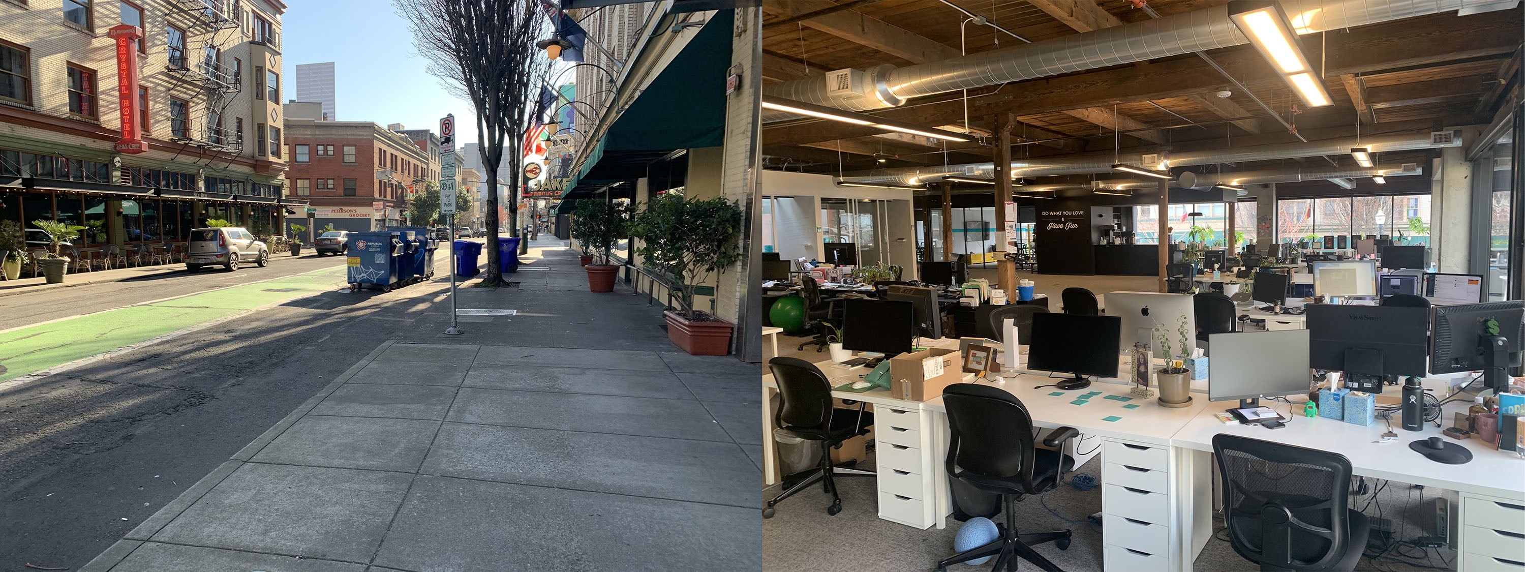
It's been a bit since I've done a status post, but Covid-19 is the new reality, and it isn't going anywhere. The company I work for was in the state of switching offices even before the outbreak with the lease ending in April, meaning I haven't had an office now for more than two weeks as it had to be cleared out before then. I was the last worker, working from our office as it was located across the street from McMenamins's Crystal Hotel, and Jake's Famous Crayfish. I didn't like the layout of our office, too noisy and too much glass but the location was desirable as Powell's was two blocks away. O Our company is now officeless and has been a blessing as we're now virtual, and there's no overhead. Dealing with the reality of Covid-19, our company likely will not get an office until 2021. The owners have zero reason to believe that we'll return to normalcy by then, and I don't blame them. I don't either.
Streaming

Table Rock, April 26th, 2020
I've managed to get out of the house. Social distancing doesn't mean you have to stay indoors in a state as unpopulated as Oregon. While entertainment is at a standstill, I've discovered something. Some of Amazon Prime's TV shows are very good. I highly recommend Undone. I'm not into animation, but the rotoscoping is fantastic and compliments the uncanny reality of the show, blending a wonderfully human tale with elements of sci-fi. It also stars Bob Odenkirk. If that isn't a selling point, I'm not sure what is. Also, Fleabag was very good, Upload is fun and a little too real and the Jack Ryan series, is familiar but still entertaining.
While Amazon has been at the original content game longer than Apple, I have to say among the streaming services, Apple remains one of the least compelling. I'm more interested in CBS's streaming service than Apple's and they're a second-tier player. As it stands, Apple's entry to TV is still a mystifying one. Unlike its other digital media services designed to sell other people's content (Apple Music, Apple News, whatever-they-call-their-movie-rentals/movies sales/TV show sales), the only original content comes from: Apple Arcade, Beats One Radio and Apple TV+. Apple Arcade is Apple doing what it's always done: sell software. Beats One is free, and more about showcasing Apple Music content. Apple TV+? It's just weird.
-
How to use Zoom with external web cams, iPhones / Android Phone and/or Snap Camera on MacOS
After the Zoom v4.6.10, Zoom broke support for external webcams, and apps like Snap camera (snap chat filters for your desktop computer). This is due to the recent versions more closely following security provisions pushed by Apple that libraries now must be validated and thus breaks the ability to use external camera sources.
I personally use EpocCam Pro and my iPhone as a camera as its a much higher quality camera (I'll explain this below).
The following is based on a reddit discussion.
- Update Zoom to the latest version
- Install Xcode via Terminal
xcode-select --install - Once installed make sure Zoom is closed and run this in Terminal
codesign --remove-signature /Applications/zoom.us.app/
Using a phone as a webcam with Zoom
There's no reason to buy a dedicated webcam if you don't mind using your phone or have an old smartphone lying around. Your smartphone's camera is undoubtedly better than any dedicated webcam on the market, so you might as well use it.
After enabling Zoom for external cameras, install Epoc Cam on your iPhone or Android phone, there's a free version (iOS, Android) and paid version (iOS and Android) that removes watermarking, and enables higher resolutions.
- Enable external cameras for Zoom using the above hack
- Install EpocCam or EpocCam Pro on your phone
- Install the drivers found EpocCam's website, kinoni.com (scroll to step 2)
- Launch Zoom
- Launch EpocCam (make sure your phone is connected via wifi to the same network your computer is on)
- Select EpocCam from Zoom, and it should connect.
-
Shelter
Portland, March 23rd and March 24th, 2020
I've meant to make another new reality post, and I've put off as it seems trite, as by now almost everyone is experiencing it globally.
Biking to work is now a bit of a novelty. Usually, I'm one of the very few bikers to be found in downtown Portland these days, although I've seen a fair amount of leisure biking now that the weather has turned nice. Some bikers have an apocalyptic vibe, wearing sunglasses, gloves, and bandanas, taking the face mask recommendation to an absurd degree.
I usually see a few other bikers, but on 03/25 on my bike ride into work, I saw one other biker. Just one. Headed the opposite direction, and that was on in the South East, but I did see a lot of people walking.
Since then, with the nicer weather, I've seen more people on bikes, but mostly limited to the South Eastern neighborhoods that I frequent.
Bad Policy
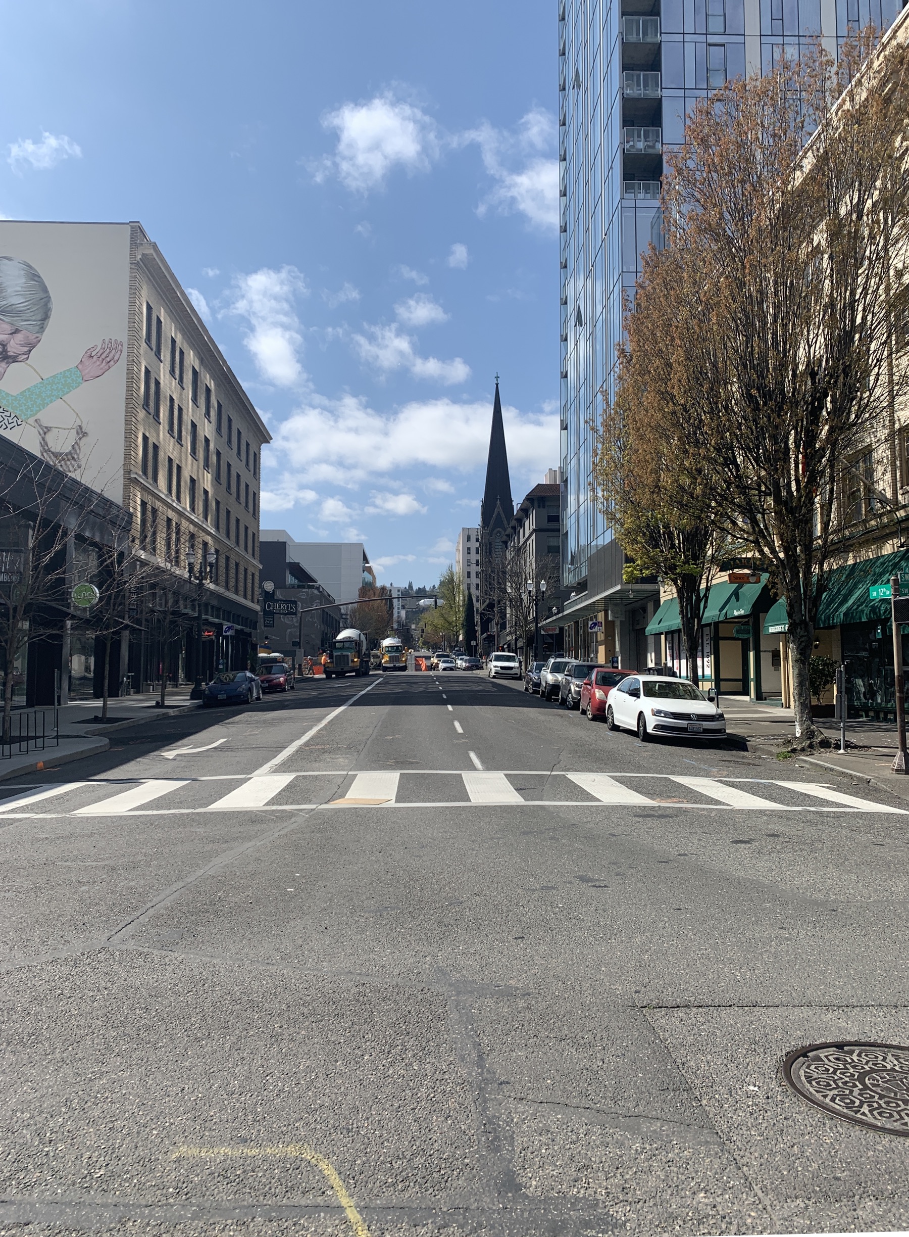
Portland, 12th street, April 07
It's hard not to talk about the politics of Covid-19, as Donald Trump is wholely unqualified As he's either willfully ignorant or simply lacks the mental faculties to comprehend, let alone take action on such a multifaceted problem. There have been weeks of reporting that he and his staff ignored the health experts. The Guardian called his latest briefing presidential tantrum after tireless reporting that DJT ignored key advice. Meanwhile, Trump continues to make dictatorial edicts towards states who are acting responsible and using Covid-19 as a way to roll back regulation. NPR ran a line-by-line breakdown of his promises, A Month After Emergency Declaration, Trump's Promises Largely Unfulfilled. Trump gives himself a perfect 10. Meanwhile, he constantly plays with firing Fauci. Trump has a very delicate ego.
Quite frankly, if you do not believe Trump botched his response to Covid-19, you are willfully ignorant of the facts. Hospitals lack safety supplies. Trump failed to follow the recommendations of Health experts. People have died because of his gross incompetence. He has not delivered his promises and continues to give poor advice to Americans. History will not be kind to DJT.
Bad Reporting
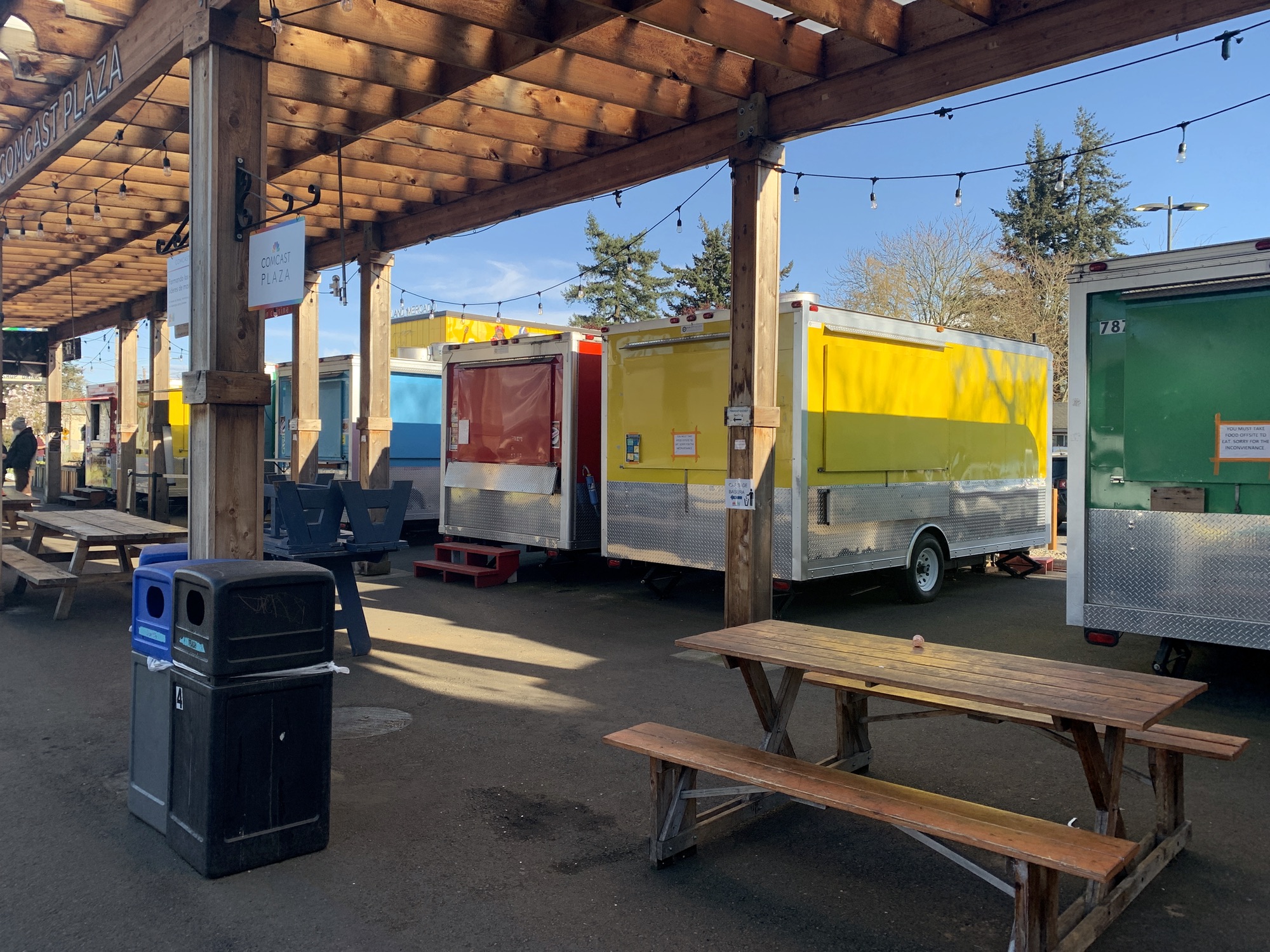
Mericado Food Carts, April 5th 2020
Also, I'm frustrated thus I'm going to direct it against something absurd I've seen posted a few times Big Brother during the coronavirus crisis: GPS data shows which Oregonians are following ‘social-distancing initiatives’ GPS Data Shows Eastern Oregon Isn’t Listening to Social Distancing Directives. You can see the "quality" journalism from WWweek and The Oregonian, itching to slander eastern Oregon. While I might have some political differences being a single-origin cold brew drinking, bike commuting web developer in Portland, I'm from truly rural Oregon, my graduating HS class was 60 people. I could list a laundry list of things my home town does not have (Mall, McDonald's, Fred Meyer, Walmart, StarBucks, Movie theater, etc) but the point is to get to a Costco or Trader Joe's or Home Depot, it's 139 miles. It's 25ish miles to Fred Meyer (Kroger) or Walmart or Safeway. There are two grocery stores and two hardware stores, though.
So I call bullshit. Straight up, 100%, USDA grass-fed bullshit as its using a flawed metric. Oregon is a rural state, it's population density would make it the #4th least populated European nation besting out Finland and Kazakistan, and we're fractionally larger than the United Kingdom by landmass. So for starters, anyone living in rural Oregon has large distances and considering roughly 3/4 of the state's population lives in the Portland Metro, Salem metro or Eugene metro, the density of the rest of the state is SPARSE. One look at the map shows the counties' "score" is a strike against population densities. Next up is the dubious methodology:
"Unacast’s location data comes from games, shopping and utility apps that tens of millions of Americans have installed on their phones — information the company normally analyzes for retailers, real estate firms and marketers."
This also seems like a test of modernity, job type, and technical affluence. I, for one, probably do not have unacast applications installed on my iPhone, and block location gathering for everything sans an exceptionally minor amount of applications and often use a VPN. All it shows is the movement has been MORE reduced in areas that have a lot more businesses that would be closed (service industries) or can be done remotely. Unacast is almost certainly isn't tracking devices at the tower level, so the data it's collecting is skewing towards likely Android users were until recently, it made it more difficult to block tracking, also meaning the more reduced users in rural areas might also not being accurately tracked.
After that, there's no way to gauge if the people are socially distancing, or what kind of travel people are performing. It's one thing to drive to the coast, but it's entirely another to drive to your job on the a farm or factory to keep grocery shelves stocked. Nor does it show if the people are clustering in densely populated areas. It's much easier to come into contact with hundreds of people in Portland just by visiting one or two stores, but doing that La Grande would take a lot more effort.
Escape
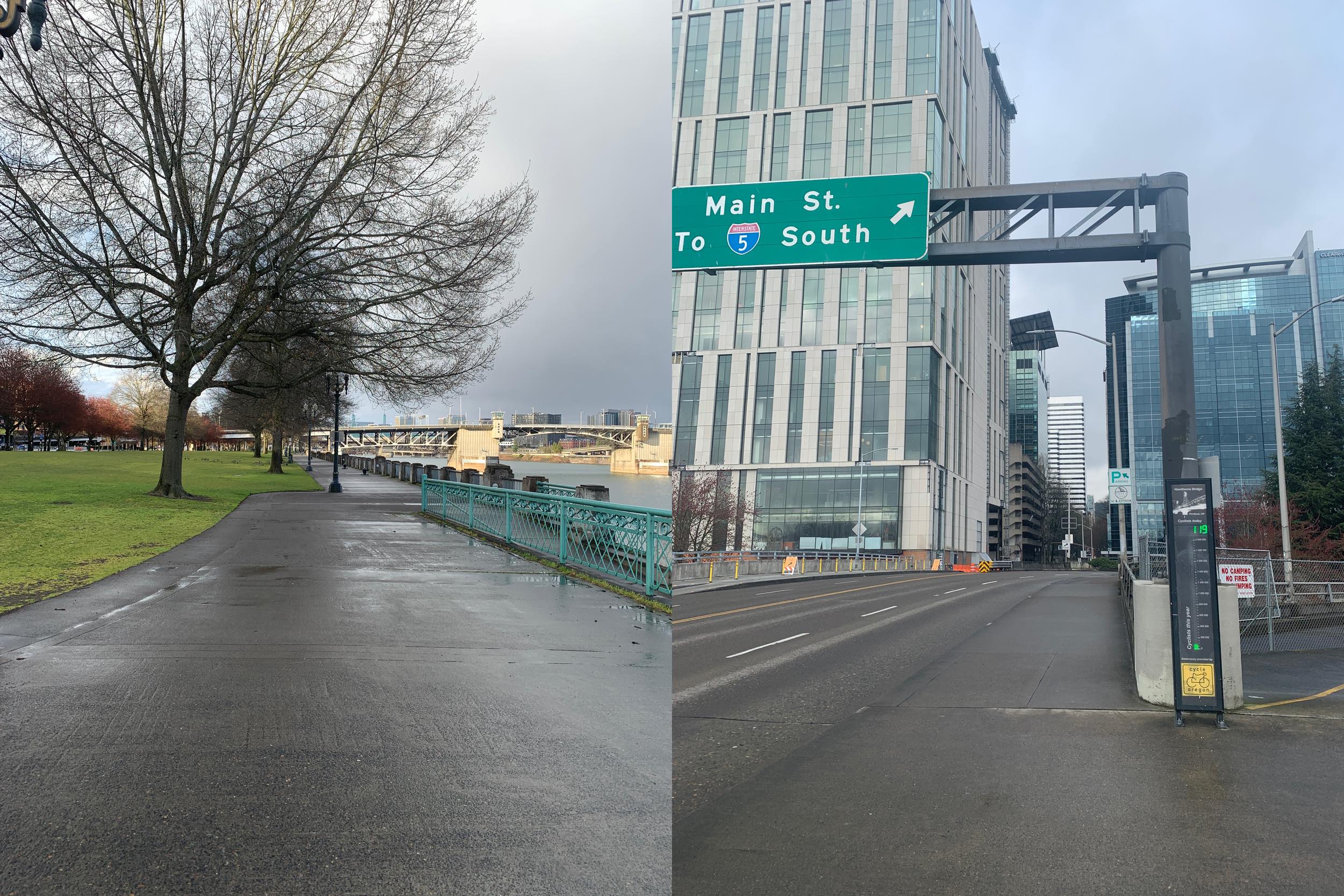
Windmills near Goldendale , March 28th and Pioneer Square, April 5th 2020
I've quietly taken to also hiking on BLM lands, which is a loaded thing to admit, but off by myself in the woods strikes me as a lot less dangerous than a trip to the local Target. Before someone lectures me like a parent, I get gas in PDX and bring my own food, and do not see other humans. I'm not part of the quarantine Olympics, or social media grandstanding. It's how I feel normal, just doing an activity that I'd normally do, but in some less common areas.
-
Removing Adobe Geniune Software even after using CC Cleaner tool
So recently, while using CS6, I was hit with a message from "Adobe Genuine Software Integrity Service" that looked like the following. I have a legit copy from my company but had installed CC demos to open up Illustrator files from CC in the past, and they're legal. I'm not sure what I did to trigger this, but I found others who had been somehow dragnetted as well.
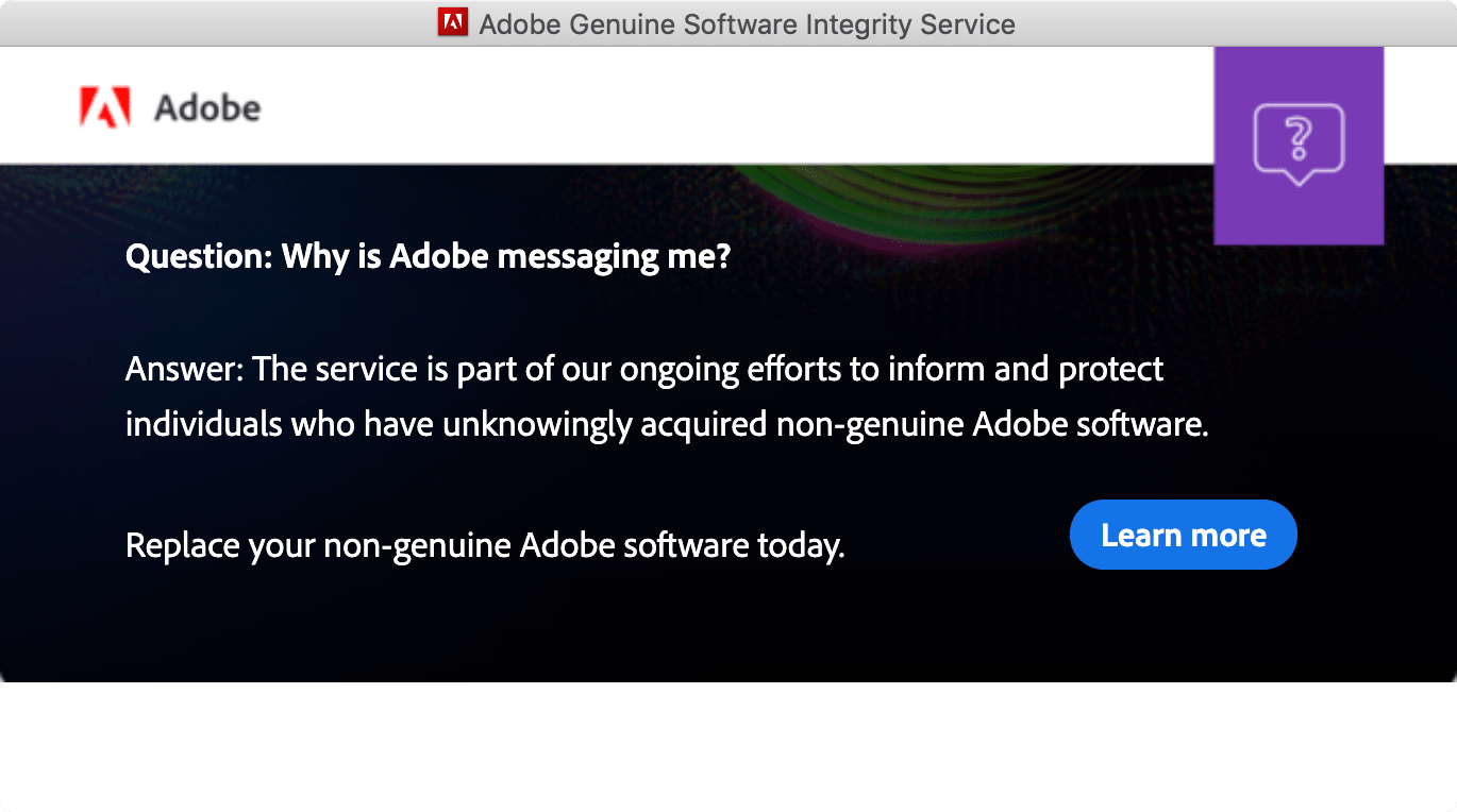
Being busy and also currently using Pixelmator Pro with some moderate success, I opted for the nuclear option and found the Adobe CC Cleaner Tool. Surely that should clear up the annoying pop-up? I removed all of the Adobe software on my computer and decided I'd reinstall Photoshop when I needed to again... and yet the pop up persisted after I had deleted all Adobe products off my computer. The popup didn't have a close button, and clicking "learn more" didn't remove it. I used the activity monitor and saw it was still running the Adobe Geniune task and force quit it. Hours later, it was back. This annoyed me.
As a UX developer, nothing irks me more than dark UX. The pop-up software failed to recognize I had removed the software in question, and better yet, why the hell is it still there if I removed all of my Adobe software? That felt deeply dishonest. Fortunately, I know how to
grepand usehtop. I debated for posting this as I might be helping out some would-be pirates but I'm annoyed that someone like me was sideswiped by this.- Launch Activity Monitor from Applications -> Utilities on your Mac. View all the running processes and force quit any of the Adobe ones, especially the Adobe Genuine instances.
- Go to
~/Library/LaunchAgentsand look for thecom.adobe.GC.Invoker-1.0.plistalthough the version may change after you have read this. Trash anything with the adobe. - Go to
/Library/Application Support/Adobeand delete theAdobeGCClientdirectory
I can't say the messaging will return if I try to re-install Photoshop but at least it's stopped the damn pop up. Buy software, support your developers, but also... I might recommend supporting someone other than Adobe, like Bohemian Coding (Sketch), Affinity, and Pixelmator. Please don't email me asking for help on this topic, as I'm not in the business of assisting software pirates.
-
Getting Numark N7s, NS7 and NS7FX working on Mojave (10.14)
But this isn't true, and it just requires downloading the v3.3.11 drivers, which can be found here (direct link to the drivers on numark.com) or at theproduct pages.
Apple really obfuscates drivers in Mojave in about the worst way possible. I'm unsure if this method works for Catalina as I've yet to upgrade, but my guess is probably not.
I personally only have the NS7s, but this should work for the NS6, N7, NS7FX as well as they all share the same drivers.
- Install the drivers
- Reboot
- You should see a System Extension Blocked message
- Go to system preferences first thing, and then click Security and Privacy
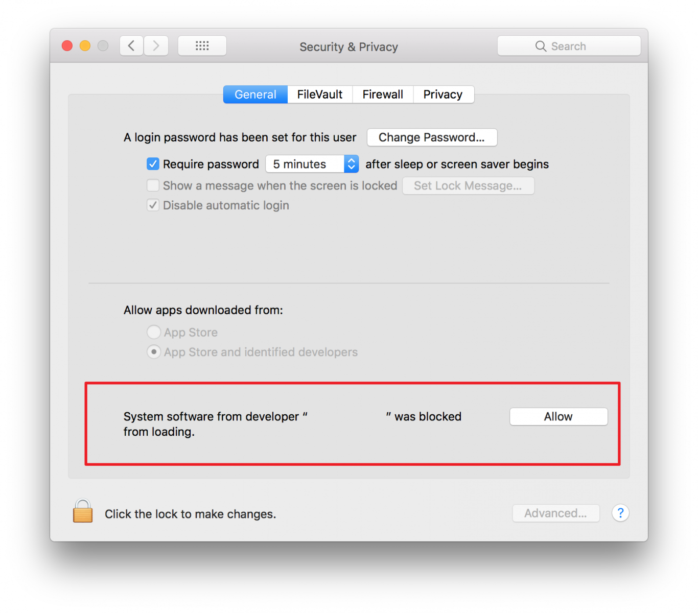
- Click the Allow button. This will bring up a list of extensions, check the Serato drivers, and look for any drivers that end with GmbH (low latency drivers) and check those as well and click ok.
- The Numark drivers come with a utility that can detect if the NS7s are connected, they also should show up in your control panel as well.
Congrats, that's it, now you can use your Numark N series in Mojave. Serato DJ Pro is free for as well.
-
Things fall apart
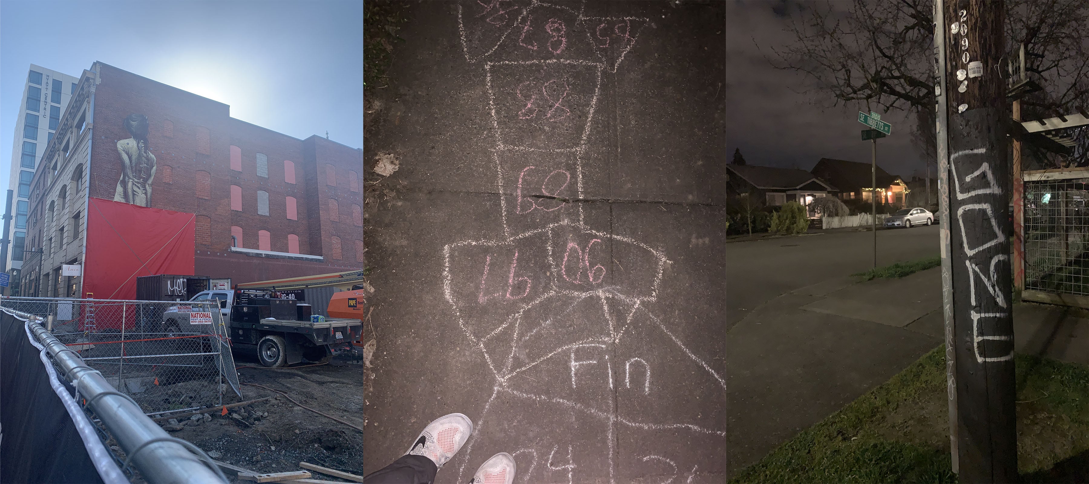
Left to Right: Downtown construction, Hosford-Abernathy Hopscotch with 92 steps, and Graffiti, March 19th, 2020
I really don't want to write about doom and gloom, but the word "husk" seems to be quietly reverberating across the city. Layoffs are happening, and they're happening fast, it hit one of Portland's star tech companies were one of my best friends works, with 50+% layoffs in a single day... and pay cuts for the remaining staff. He described it as a "bloodbath".
My brother and sister-in-law meanwhile are trying to figure out the future for their company, Bandon Rain Unique Craft Ciders. They were planning a taproom this summer, but now like most breweries, they're looking at a delivery operation just to keep interest alive. They make a wonderful product, but they've yet to bottle, and their life-blood has been keg sales. Now every restaurant, bar, and taproom is either closed or offering to-go food in a desperate plea to survive. The OLCC seems to be a bit relax for once, and although we could take a cue from Kentucky.
Protecting our culinary arts is going echo off the walls of every town and city. I just hope the shouts are heard. The PNW was a foodie paradise before foodie was a word. Oregon is a state that prided itself home to the best breweries on the planet, fantastic coffee, renowned vineyards, and home to the best damn cheese in the world. We've enjoyed these things for decades, and to lose them would be a travesty. This isn't though just for Oregon or the PNW, but goes for all the regions, everywhere. Food is sustenance, and sustenance is life. There's a reason why we cherish those who excel in it as it forms one of the bedrocks of culture. Humanity certainly will survive but at a cost. I'd much prefer this to be financial than cultural.
Universal Basic Income has to be a new reality. Meanwhile, in a nihilistic fashion, the Whitehouse is asking to delay layoff figures, so the carnage might be hard to measure. Oregon seems to trail Washington and California. It's a dice roll, will we have a lockdown? Portland shoppers sure think so.
On a more positive note, bike rides home have been uplifting. I had to dodge and weave people around the waterfront yesterday (dare I say crowds?) as people are still going for runs, walking the dog, and trying to find enjoyment.
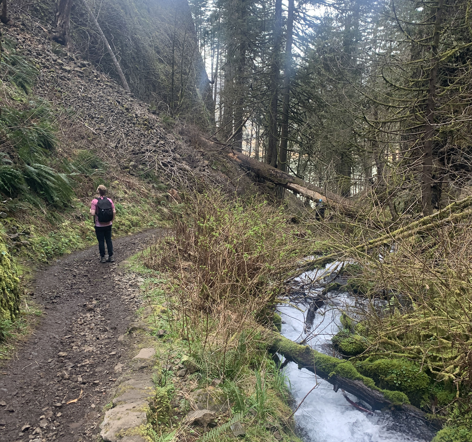
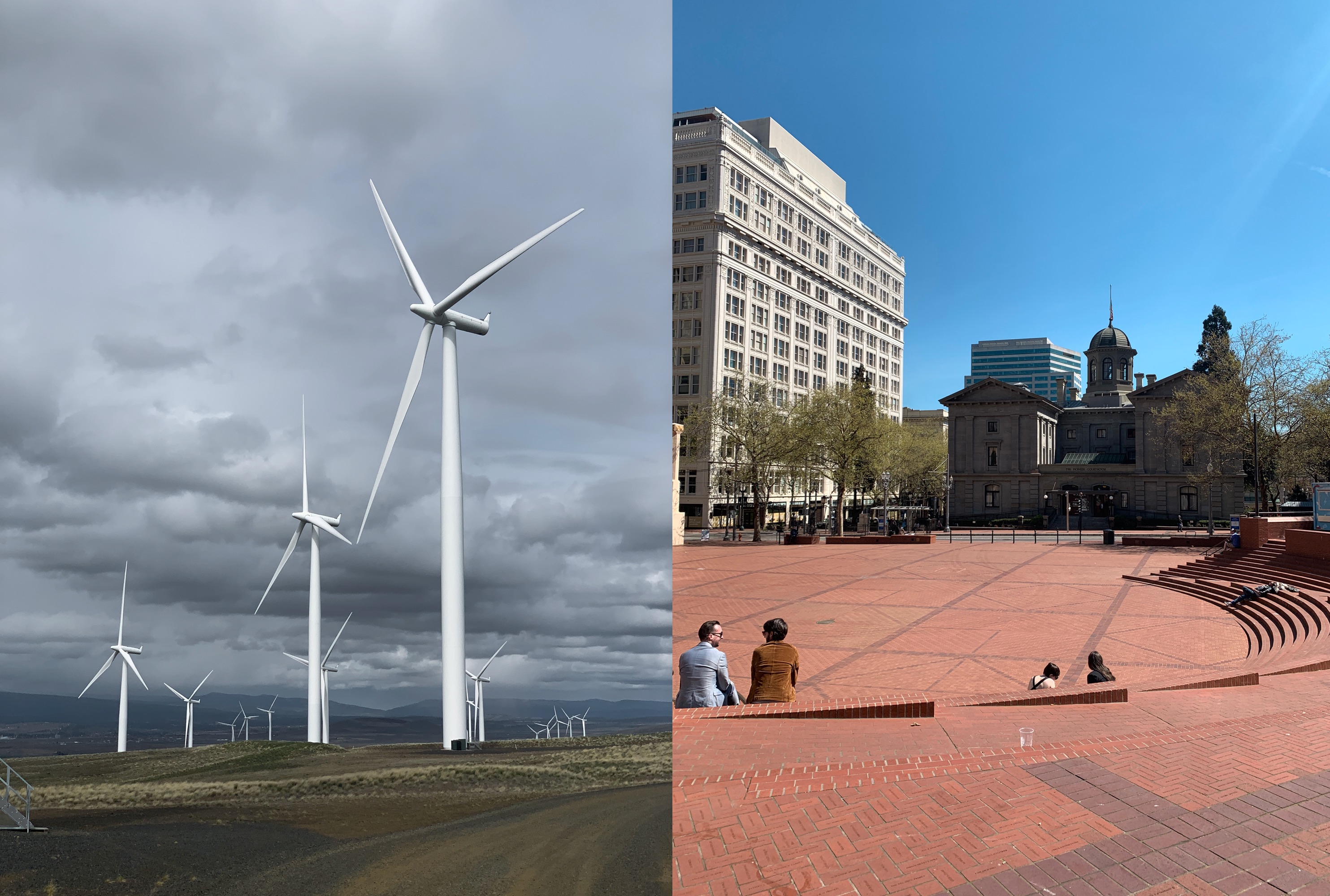
Unknown solo hiker, Wahkeena Trail, March 20th, 2020
I left work a bit early with Becky and hit the Columbia Gorge to visit Wahkeena Falls and Fairy Falls. There were quite a few people out, and Angel's Rest lot was packed in a way even for a Friday was beyond what I'm used to seeing. Unlike downtown, there was a bit of sterility among hikers, by avoiding acknowledging each other as if social sanitizing their behaviors. Usually, people are friendly and smiling. If I could think of a better word, I'd use "somber" to decribe the mood but it doesn't accurately describe the experience.
It was another night of social distancing in a city park with beers among friends. I picked up Crowlers for $6 from Wayfinder. I hope their business makes it. I hope all of them do.
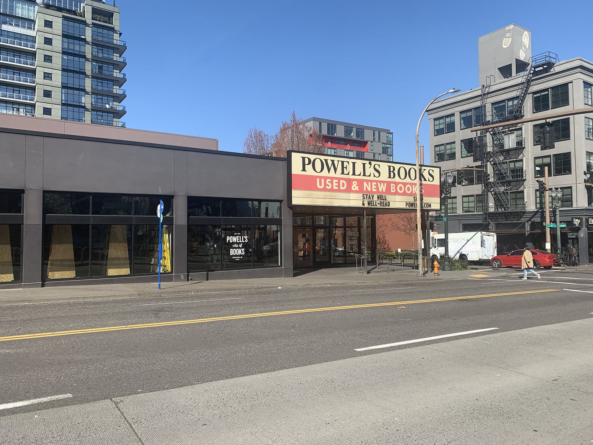
Powell's Books 'stay well & well read', March 19th, 2020
-
Normal
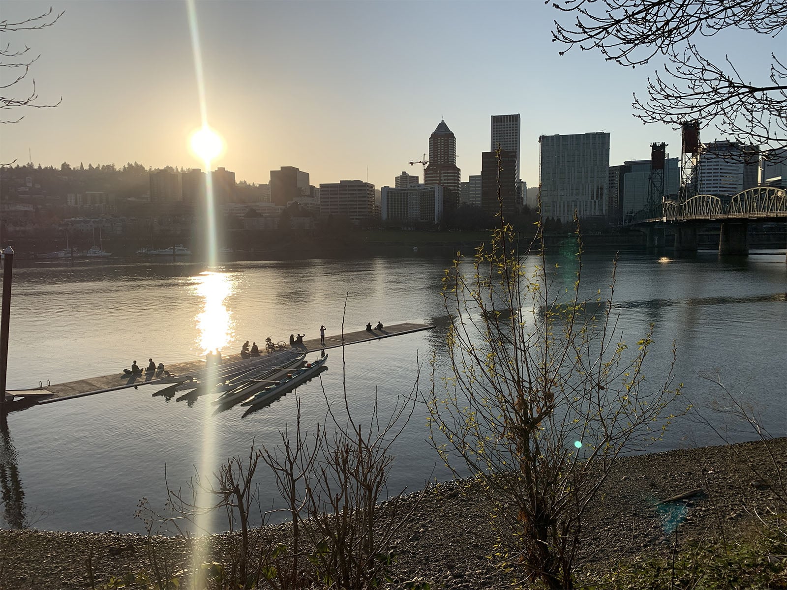
Social distancing on the docks, Portland, March 18th, 2020
Normal is the buzzword for Wednesday. News media has run amock with it, and the most on the nose being the local Willamette Weekly, "This is the new normal". The other buzzword is likely to be the "Shut-in Economy" as people demand at-home services. Amazon is hiring big in PDX, and sadly this might upend local shopping as we know it. In the book, The Warehouse a series of terrorist attacks, causes everyone to close in and fear going outdoors, work, and shop exclusively from the oligopsony, Amazon-like corporation. It turns out it's much more mundane.
Work is work. Coworkers are still cool, and like everyone, we're scrambling to figure ways to stay connected, including a running group where we log our exercise as health is a concern for all of us. Hopefully we have work in the future.
I decided to start an office wellness program: Since Target is down the street, I'll start a morning trek to score toilet paper, I don't intend to horde it, just get enough in case an office mate runs out and needs a few rolls, they can swing by and pick it up. There should be one community source than each one of us hoarding for the end times. It's all in the name of reducing stress.
After work, biking home has a soulful serenity, as people in pairs of twos mill around and enjoy just being among each other and outside. Even behind the beauty is the melancholy backdrop, as the iconic Powell's announced it's response plans.
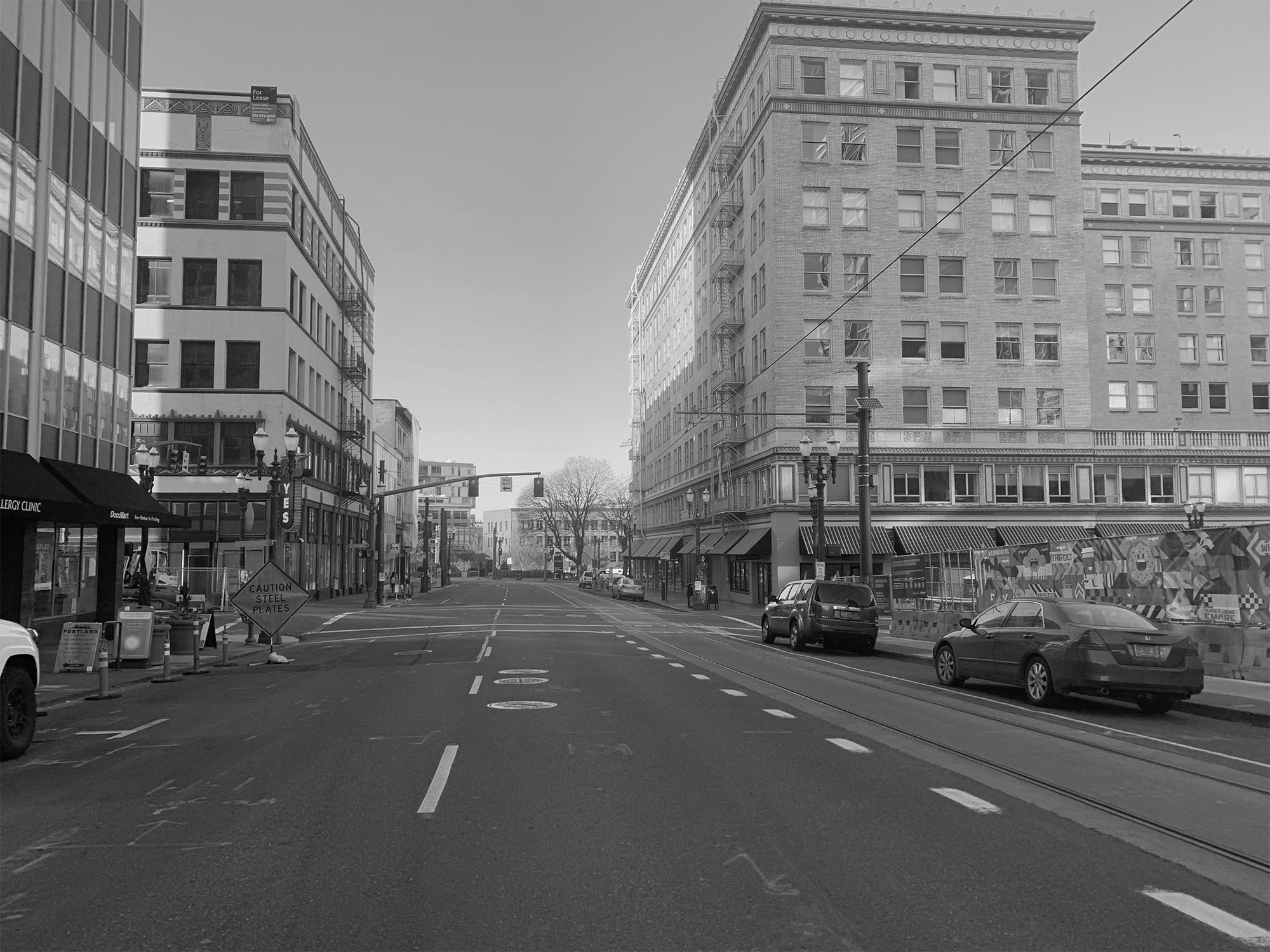
10th Street at 10 am, Portland, March 19th, 2020
I met two of my friends for beers in Laurelhurst park last night, sitting a few feet from each other, talking and drinking. This is the new normal.
-
Reshaping
This blog has never been directly about me. It's always been mostly how-to guides that are reflections of problems I've encountered in adventures in tech. Maybe you know, maybe you don't, but the cliff notes are I've been working in tech since 2010. I moved from Eugene, Oregon, to Portland, Oregon, in 2013. Many people visit my blog, in fact nearly 20,000 people do a month. Despite the numbers, I don't know if I have any connection with readers.
So I've decided to shift the blog a bit as it seems impossible to just mindlessly blog about tech without addressing the elephant in the room. This means letting my actual life bleed into this blog. I haven't decided on a format, but I'll let it organically evolve, as such things have had a habit of working themselves out. It probably won't be daily, and it'll probably occasionally have politics, which professionally I tend to avoid. It'll also still contain helpful blog posts around silly technical issues, as always
Portland's downtown isn't a ghost town, but it feels perpetually like Portland's downtown at 7 am on the weekend. There's some bustle, but a bulk of businesses are closed, and offices are empty. I have the luxury to work from home, but in an ironic twist, for once, I do not want to as my apartment starts to feel more like a jail shared by two people. Thus, I'm the only person in an office space that's designed for roughly 45-50 people and usually occupied by about 25. As such, there's no one really to endanger, although I have a feeling I'll see a coworker or two finding the same sort of solace in an office space of all places.
It hasn't hit me hard, as inconveniently dodging mindless people involved with their cellphones still feels like a relief. I'm, however, far from an introvert, and thus, even the basic interactions of getting take out are welcome from Cafe Yumm.
The iconic coffee shops are closed for the most part (tried both Stumptown and Heart in my area), and restaurants have desperate "We're open! Take out only!" messaging. It makes me wish I had more money to give. It's strange to see so much infrastructure dedicated to people be somewhat void of them.
One of the more ironic fates is for years has been a sense of paranoia and fear from people of many political persuasions that big government is bad and inefficient. Here we are, makers of our own doom with a president who shut down an NSC pandemic unit despite being briefed on an eerily similar scenario and incapable of understanding basic facts and now we're forced to come to terms with slash and burning of the government. Death and taxes are the two truisms but have ever considered death being delayed by taxes? Perhaps a functional federal government isn't so bad after all.
-
This changes everything...
Yep, it's a Corona post. You literally cannot escape it, as it's the unending vortex. With pretty much all entertainment slowly being whittled away: pro sports, college sports, restaurants, concerts, movie premieres, theaters, plays, theme parks (even Vegas), gyms there's little else to focus on other than news, and how little there is with the all of those as mentioned above being closed. The global recession is on its way.
What's clear is the worst has yet to come and will define a generation in the way 9/11 defined a previous one as it has the creeping paranoia of post 9/11 with the despair of the 2008 stock market crash. Even if the virus disappeared tomorrow, there'd still be life before the panic and life post-panic. It's a broad spectrum and reach makes it different than other tragedies as it's happening at a granular level, per person, creating macro-event that is felt by everyone.
There are some silver linings as there likely to be some societal changes as vaccines will become en vogue. Hopefully, a nation will find more common ground with its neighbors as everyone will be experiencing the effects of society on pause, regardless of socio-economics. Just maybe, also those who don't value science will start to do more as we're all counting on sciencing our way back to normalcy.
That said, things are going to get rougher as incomes shrink, entire sectors are going to be hurt with cascading waves. There'll be some people who prosper and profit, but most will not. We've already seen some of the American psyches at work, filled with paranoia and creeping anxiety, causing the typical spike in guns and ammo sales, coupled with a newfound obsession with toilet paper. To borrow Bill Maher, "people are scared shitless."
I don't have any real salient advice as I'm neither a healthcare professional nor a high ranking bureaucrat. I've seen some positive pieces, asking people to buy gift cards. I've also seen the first gofundme for a small Jazz club in Portland. It isn't enough, but at least people are looking for solutions. For the interim, I'd suggest reacquainting with the great outdoors as in North America, most of us live near beautiful splendor, as we have many biomes and geography to explore. It's a chance to unplug and go hiking, mountain biking, kayaking, or whatever your flavor is.
Lastly, the best resource I can name is Ars Technica's Don’t Panic: The comprehensive Ars Technica guide to the coronavirus, demostrating why they're the best in the biz (the author has a PhD in microbiology).
-
Can't beat 'em join em.

As per whatsmybrowser.org, Edge is Chrome on Windows...
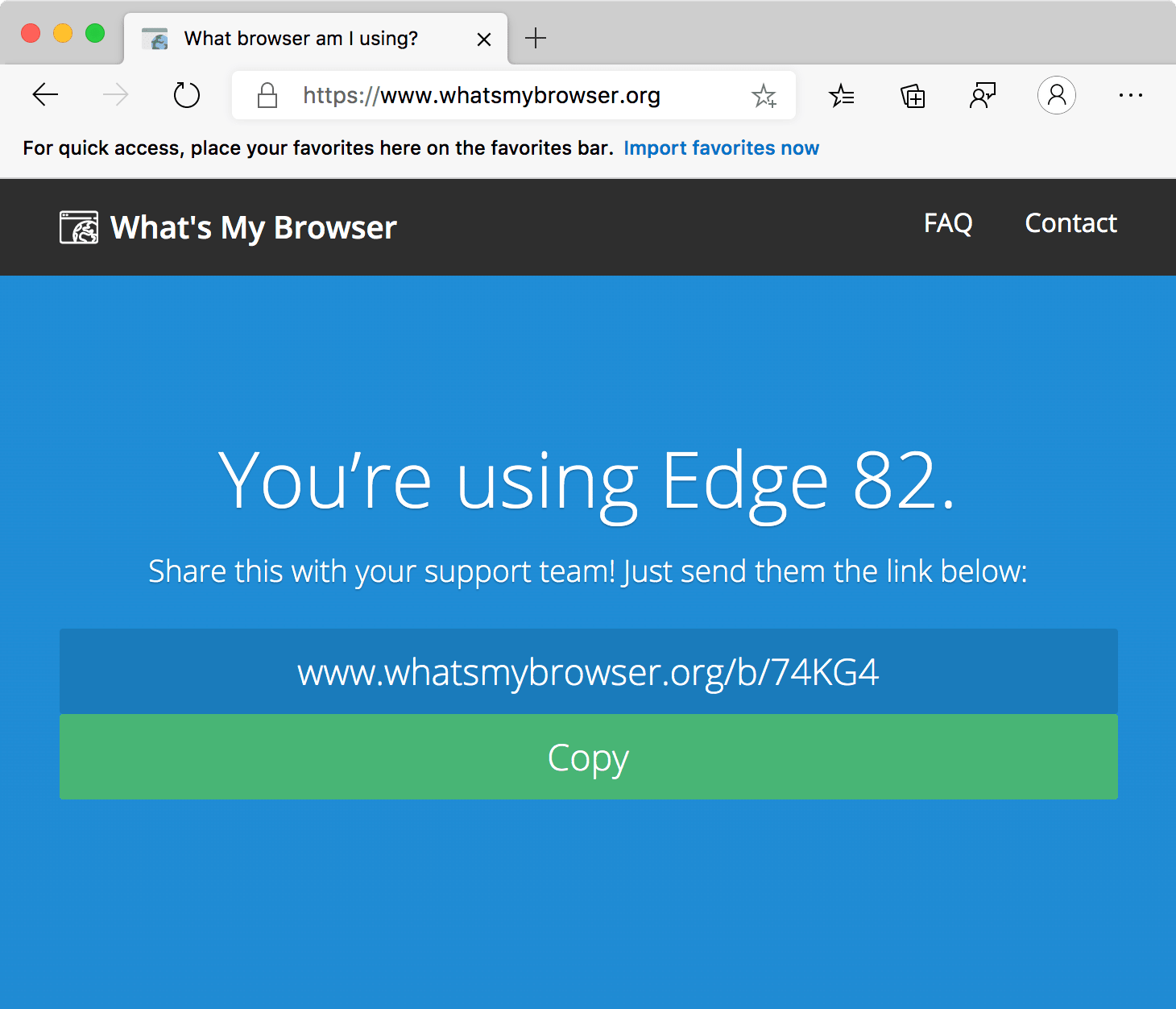
...and as per whatsmybrowser.org, Edge is Edge on macOS.
I imagine this will be sorted by the "what's my browser" genre of sites in time but still amusing for the time being. I wrote up my thoughts about the death of EdgeHTML in late 2018.
-
Thinking about Gutenberg and Web Components
With Wordpress 5, Gutenberg has introduced a (nearly) modular experience for content creation, allowing for amazing customization previously not seen in the open-source world. Gutenberg also has an active port for Drupal, and even allows Drupal modules to be inserted into pages and promises full compatibility between Wordpress and Drupal. Suddenly Gutenberg seems like the solution for the woes of CMSes.
A Brief overview of Gutenberg's workings
Gutenberg works because of it's simplicity. CMSes previously always fell apart when the user wanted to enter content that a template was equipped to handle. This meant adding fields and/or modifying/creating a new template. The way Gutenberg approaches this is to simply store HTML with flags around the content to define a Gutenberg block. Rather than using multiple database fields, Gutenberg stores its data within the post-body. This in itself isn't novel, but how it's handled is.
A Gutenberg block has two presentations:
- An editor view visible when creating a page or post
- The rendered page (front end) that a regular visitor sees
Where Gutenberg is clever is that the block for the admin view, the markup is parsed into a React component, and the states for the component are captured and written into the block as the developer sees fit. A Gutenberg block can actually consist of Gutenberg blocks inside Gutenberg blocks, meaning developers can leverage pre-existing blocks to create new blocks.
The big downfall is that the markup is very fragile. If you were to change a Gutenberg block's HTML output, all previous blocks will result in errors such as “This block appears to have been modified externally”. Gutenberg does include validation.
Where Web Components come in
Below is the save function for a really simple Image block I wrote.
      save: props => {
            const { imgURL, imgAlt,  imgURLSmall, selectControl } = props.attributes;
          return (
              <div className={selectControl} >
                <picture>
                  <source srcset={ imgURL }   media="(min-width: 992px)" /  >
                  <img src={ imgURLSmall } alt={ imgAlt }/>
                </picture>
                  <caption>{imgAlt}</caption>
              </div>
          );
      },
Let's say, at a later date I wanted to change how my image block renders, and changed markup :
      save: props => {
            const { imgURL, imgAlt,  imgURLSmall, selectControl } = props.attributes;
          return (
              <div className="responsive-image">
                <picture>
                  <source srcset={ imgURL }   media="(min-width: 992px)" /  >
                  <img src={ imgURLSmall } alt={ imgAlt }/>
                </picture>
                <div className={ selectControl}><caption>{imgAlt}</caption></div>
              </div>
          );
      },
You'll notice that it now has an image container with a different class, and the caption now has a parent
div. Every image on the site would now be receiving a “This block appears to have been modified externally”. One vector would be validation, but an even simpler solution would be to avoid this error by using a web-component. In this hypothetical, I've offloaded all the rendering to a web component, calledmy-imagesave: props => { const { imgURL, imgAlt, imgURLSmall, selectControl } = props.attributes; return ( <my-image src={imgURL} alt={imgAlt} small-image={imgURLSmall} selectControl={selectControl}></my-image> ); },Not only do we consolidate all the markup to prevent validation problems, we also have the bonus of the web component world. Any frontside JS features, perhaps a lightbox for our responsive image, could be handled, complete with encapsulated CSS. The opportunities only expand as you leverage slotted content.
I plan to update this post with actual code demos soon. Stay tuned.
-
macOS 10.15 vs Windows 10: Apple is losing ground
After a few discussions and my previous blog post, I've noticed that I've changed my tenor on macOS, by far my most loved Apple product. I used without question profess macOS as the superior OS* (aside from gaming). Unfortunately, this post is going to feature some serious nerdage without a lot of explination, for the sake of brevity.
Now that asterisk has expanded to include a lot more things. Take the following: I cannot properly stream a 4k movie 1 in surround sound 2 in HDR 3 on an Nvidia GPU 4 or be sure it's using hardware decoding 5.
Let me break that down:
- macOS currently does not support the latest DRM that Netflix most other DRMed streaming services use. macOS is capable of playing back 4k media. Windows can play back 4k Netflix in Edge and its app. Vudu and UltraFix also support 4k Windows playback. Windows users face the same issue as Mac users with Amazon Prime and Hulu.
- macOS still does not have any multichannel decoding for popular consumer codecs from Dolby or DTS. Even the Apple touted AAC can do multichannel audio, but macOS has no ability to decode to multichannel outputs. macOS can route multichannel audio via CoreAudio using prosumer/professional hardware, but to this day, no front end for software exists to route multichannel audio to analog outputs. It can, however, pass pre-existing bitstreams via SPDIF and HDMI in a few applications, most notably VLC and not any Apple software.
- 10-bit support for macOS is completely bonkers. My MacBook Pro 15 inch 2017 has a Radeon Pro 555x and reports 10-bit on the internal display. The internal display is not 10 bit, but rather 8 bit. My Mac Pro 2010 has a Vega 56 connected to a BenQ PD3220u (a true 10 bit panel, not FRC) reports 10-bit, but it's unclear when/if 10 bit is actually being piped to the display as I can't seem to read the bitstream info. Mac OS does not any consumer formats for HDR support regardless. Windows 10 will automatically in games trigger the HDR color profile on the monitor as it detects the HDR10 bitstream. macOS never even does this. By visual tests, it appears my MacBook will output 10 bit to the monitor. The Vega 56 will not but reports otherwise.
- Apple, as of 10.13 has actively blocked NVidia support for any non-Keppler GPU. Want an RX 2080 for your Mac Pro 2019? It'll only work in Windows. The spat has drawn widespread media coverage outside the Mac universe. Theories range from eGPU support to Nvidia and Apple stalemating over CUDA. Whatever the case, Mac users are severely handicapped in GPU choice.
- Apple no longer officially supports hardware decoding for certain codecs for non-T2 chipset enabled computers. My MacBook Pro 2015 in Catalina now uses the T2 chipset to assist with H264/H265. My Mac Pro, despite having much better hardware without the power consumption requirements, does not. It is unclear if the Mac Pro 2019 can use its $5000 GPU options to assist with these codecs.
I do not like Windows 10's UX (Why does it have two sets of control panels still!?!?) and inborn advertising, but you gotta hand it to MS. I can run some programs written for Windows 98 using compatibility mode, any 32-bit apps, and it comes with pretty good threat detection with Windows Defender.
Apple did something though that MS never had to clear two nearly impossible hurdles with the Macintosh platform. The first, switching from Mac OS 9 to *nix, and jumping x86 to PPC. This meant to a few less-than-ideal solutions like Carbon, which eased Mac OS 9 to Mac OS X. That said, x86 Cocoa Apps (Carbon's successor) from 10.6 often do not work in macOS 10.15. Apple does not offer a compatibility mode. Apple also dropped 32-bit binary support in 10.15 arbitrarily, meaning old apps are even less likely to work. This is not a confidence builder for a platform's robustness.
As far as threat detection, Apple's "security" almost entirely comes from negatively sandboxing the user in 10.15 and over-reliance on signed code, which ironically puts power users at greater risk, as they're the most likely to disable system-integrity-protection. It's evidenced by Malwarebytes' report that Mac malware outpaced Windows PCs threats for first time in 2019. The T2 chipset has some interesting features, and eases things like disk encryption but also is wantonly silly for the most common threat vectors and gives less-educated users a false sense of security. Apple has gone to excessive lengths recently to iOSify its security by depreciating services like Kexts but still has yet to offer threat detection. The Mac Pro 2019 cannot use 3rd party SSDs in its two factory SSD slots because of the T2 despite plenty of M.2 adapters existing to Apple NGFF. If anything, the T2 chipset feels like kneecapping macOS with self-destruct button it can hit at any time, locking users out of their own hardware.
Lastly comes the most controversial statement, but macOS is not the fastest OS. You can take your pick of benchmarking site, but macOS on the same exact hardware routinely is bested by Windows (and, of course, Ubuntu). It's tough comparing benchmarks as many tasks aren't fully cross-platform, or some are heavily stilted towards a single platform (example, Java drastically performs better on Linux than Windows or macOS). That said, all things considered, Windows generally performs better than macOS by a noticeable margin, be it better-assisted technologies like CUDA, or DirectX, better ports, and sadly many native OS operations.
The last great push forward feels like 10.9 Mavericks when Apple introduced Timer coalescing, Memory compression, App Napping, 4k support/Retina for all (10.9.3), maximum RAM increase beyond 96 GB, IPoTB (ThunderBolt transfering between two Thunderbolt equipped Macs), ability call/receive Facetime and a notification system (finally putting growlr to rest). Compare that against Windows 8.1 (both OSes release in 2013) which was almost entirely damage control. I used to confidently say OS X was the best, but in the era of macOS my answer far more pragmatic: "it depends".
-
macOS Catalina 10.15 is a disaster
Every year, Jason Snell of SixColors does a round-up of Apple via a scorecard from various Apple pundits, the interesting takeaway was Catalina was a bad move. I always find this interesting, as an (exceptionally) minor one myself. Gruber has some of the most damning feedback.
If Apple has somehow determined that typical users need these sort of permission alerts, fine, but there should be a single switch for expert users to toggle to effectively say “I trust all of the software on my Mac”. Call it “Pro Mode”, call it “Developer Mode”, call it “Expert Mode”, whatever. But I don’t know a single expert Mac user who is not seriously annoyed by the heavy-handed security design of Catalina. Not one. Every single expert user I know is annoyed. That is a bad place for MacOS to be. MacOS 10.16 needs a serious course correction to fix this, and if 10.16 goes the opposite way — growing even more heavy-handed in restricting professional Mac users from just using their machines as they want and expect to — I genuinely fear for the future of the Mac as a platform for serious computer users. Which is crazy considering that Apple just unveiled Mac Pro workstation hardware that can cost upwards of $50,000. - John Gruber, My 2019 Apple Report Card, daringfireball.com
Catalina marks the most significant regression in macOS functionality since Yosemite, with glitches aplomb. I've put off upgrading on both my Mac Pro 2010 and my MacBook Pro 2017 as I just didn't want to deal with the headache. This is only a delaying tactic as inevitably, I will be required to upgrade. While 10.14 was controversial for many users as it switched to Metal, it had to happen as OpenGL was a dead-end, and it made little sense for Apple to put it's GPU fate again into another OpenSource project when it had its own API.
Catalina's security conscience, as a friend pointed, was a bad pattern when Vista adopted it. It effectively trains a user to suffer alert blindness, and it actually encourages power users to disable SIP and turn off code-sign verification. Apple still refuses to introduce basic detection for when its walled-garden is inevitably scaled. All it can do is revoke certificates. This isn't very good. Having used Windows 10 and tried to use sketchy utilities like a save-file editor for an older video game, I'm impressed how reliably Windows Defender rejects applications. Granted, I'm not much of a Windows 10 user, so perhaps I'm skewed by ancedotalism but fact remains: Apple has no analogous feature to Defender. It still operates primarily on security-through-obscurity and user-hostility to promote its own app store.
Then to add insult to injury, Apple removed 32-bit Application support. There's plenty of older media utilities that'll be forever sealed to a 32 bit OS, I own a few audio utilities, and there are Steam games I have that aren't Catalina compatible. 32-bit executables weren't holding anyone back. Windows 10 has no plans to phase it out. Catatlina is exceptionally low on meaningful updates, sidecar being one of the big sells but strangely locking out hardware that is still capable of running it.
The OS has always been the catalyst for all my Apple purchases. I prefer macOS to Windows/Linux, and I prefer iOS to Android. I'm pretty sure any working professional doesn't by Apple products because of their hardware merits alone as I've yet to read of Windows users buying Macs only to run Windows full-time. You can make a strong case for the iPhone and iPad as it's indeed best in class. The Mac? Much less so. Apple is playing a dangerous game with macOS.
If I were scoring Apple's properties: the Mac line-up would get a C+, as most of its laptops still have goofed keyboards, the prices hikes have been rough, the iMac Pro is stuck. The Mac Pro is beautiful but priced out of reach in a way that feels out-of-touch. For its software, a D. iOS 13 was painful in its first releases and Catalina marks regression in functionality and bugginess. Also, there's been some idling on Logic and Final Cut Pro, although its new services all seem solid (Apple Arcade, News, TV+) and yet it's biggest win, Apple Maps landed in 2020.
I'm keeping my fingers crossed with Apple's renewed interest in "pro" comes OS upgrades and software worthy of its high priced hardware.
-
Nova Beta 7 Impressions
I'm writing this blog post using Panic Software's newest IDE, Nova.A lot has changed since the first release of Coda in 2007. At that time, we were still primarily making websites, and thus it was an all-in-one-tool tool for a different era where an FTP (yeah, remember those?), a web preview, terminal, and editor all in a single window akin to Dreamweaver without all the bloat. Panic holds a special place in my heart, as they're based here in Oregon, and hailed from PDX long before it was "Portlandia," I was a super fan of Audion, used Transmit for quite a while and as fate would have it, I work two blocks from Panic's downtown location.... I fully admit I change the color of their sign colors every now and again.
I used Coda from about 2007ish to 2013, and professionally during 2010-2013 and served, forever leaving Dreamweaver behind. I've since gone from Sublime to Atom to WebStorm, but fingers crossed, I'll circle back to the Panic.
I'm struck deeply by how much the "IDE" application has morphed into its own sub-genre of UX that defies the native OS's visual language. Any of the usual UI is generally disregarded; File trees, scrollbars, icons, gradients are all abandoned. The multi-pane interfaces look nothing like what we've come to expect as the OS standard. In short, code editors seem to exist outside of their host. I have a feeling outfitted with similar color schemes. The average user would have a tough time identifying Visual Studio vs. Atom vs. Sublime vs. Webstorm at a quick glance. However, Nova is certainly the child of Coda, as it carries a similar "Mac-like" feel. It looks fantastic in its black-text-on-white-background. For whatever reason, the dark theme doesn't seem as "nice," and it's largely due to the Apple UX choices. Gradients, transparencies, and San Francisco (the font). It's all here.
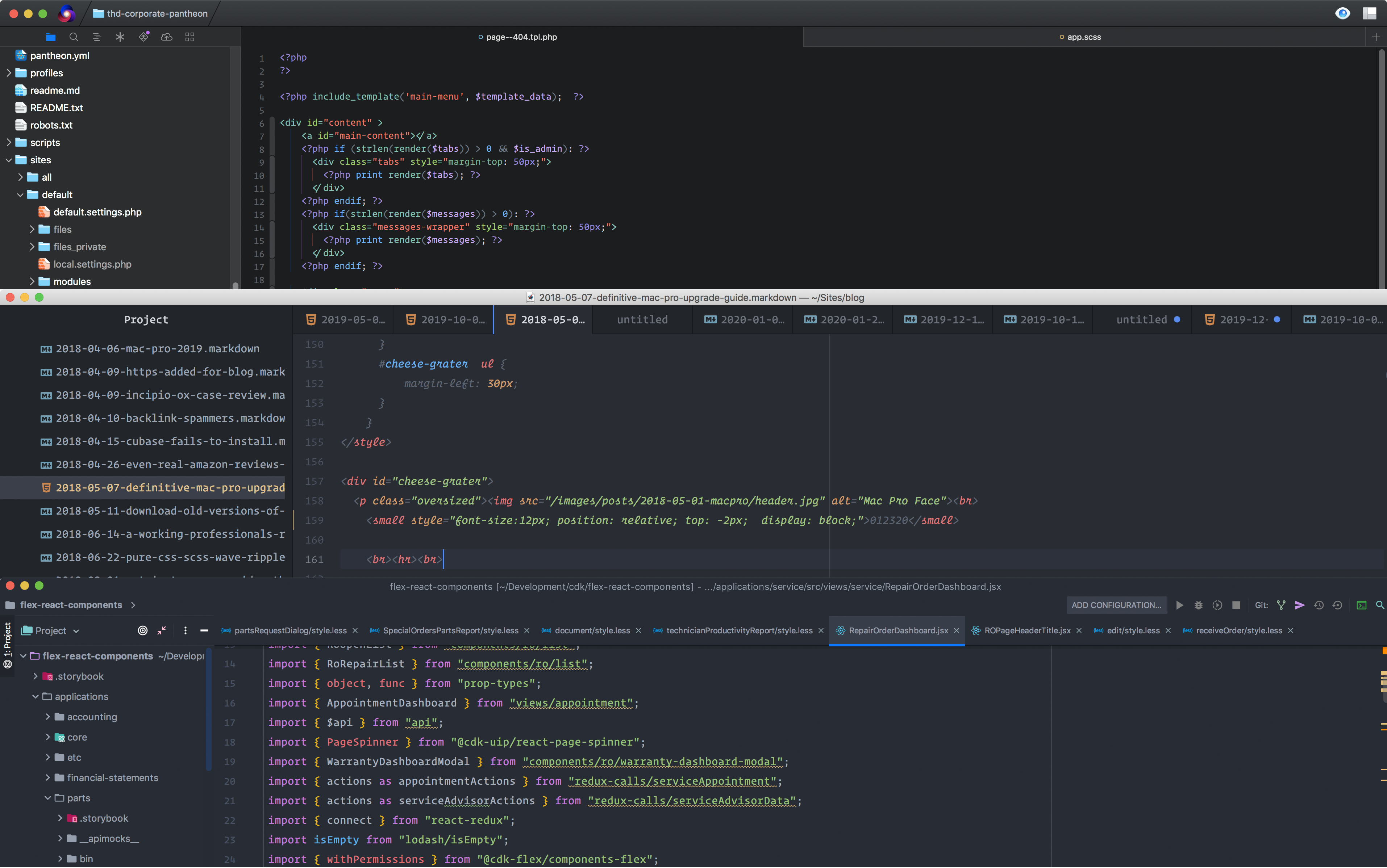
Picture: Nova top, Atom middle, Webstorm bottom
Here's what I've noticed thus far in a bullet point of unorganized thoughts:
- My first order was to switch the default font to Operator Mono. I'm happy to see ligatures are fully supported, but it's not making use of italics; thus, the beautiful monospaced cursive I love isn't rendering properly. I don't see any documentation on theming. Maybe I'll look under the hood later...
- In-window organization feels a bit more natural than the other IDEs, allow you to drag and position windows nicely. However, trying to split both horizontally and vertically doesn't work as it should. Based on the UX, I'm sure it will.
- It feels zippier than Atom/VisualStudio. Electron kinda sucks and hence why I went to Webstorm.
- The visual language all about denoting tabs by a top-border. Blue is a local document, and green is a local terminal, and purple is a remote server. The borders are only visible on the front window.
- Auto tag completion works as expected. Tag/bracket highlighting is nice is and well done.
- Docker annoyingly triggers the terminal process forever spinning icon.
- I can't rename terminal windows like Webstorm. It does name the name of the active task.
- Auto soft-wrap is, by default, on. I'm always curious as to who doesn't use soft-wraps? Am I the unpopular opinion guy when I think this should be the default?
- Extensions are the main event. Sublime paved the way on this, and Atom/Visual Studio ran with it. It's pretty clear what's the big new killer feature. Pretty much all the documentation that exists currently for Nova is for extensions. It makes sense, functionality for IDEs should be flexible and Nova is no different. The only question is can it attain critical mass? Hopefully.
- Edit: Tried Nova on my 25,000+ word blog post and the delay between each keypress and rendering to screen was brutal. Looks like Nova for now isn't as speedy as Coda 2 or even Atom.
All-in-all, Nova feels like progress.