12 weeks with Figma: A review from a developer

Introduction
I think it's important to say what this review is and isn't since it'll be a reflection a certain perspective. Rather than tackle this as full break down of all the features vs. Sketch, I'm approaching my opinions as a developer. As front end developer, I'm more hands-on graphics utilities that most devs, capable of performing design myself but electing to let people who are better at it than I do it. Early in my career, I'd of described me as a designer who could code, but for the last six years of my life, it's been the coder who can design. Through my career, I've seen a lot of utilities for designing webpages, Pagemill, Golive, FrontPage, Dreamweaver to shoe-horned attempts with Photoshop, Illustrator, Affinity Designer, and even Indesign, Quark and Pagemaker. You name the asset, and I've probably been handed it. Name the design app and more than likely I've toyed with it. Now that we've cleared that...
A bit of history
Web design and UI Design has been a strange arch. Once upon a time, we had Photoshop and Fireworks, Fireworks being more a utility than designing tool. Photoshop itself predates the internet as we know it today, debuting in 1990. For better or for worse, Photoshop today still mostly feels like Photoshop 3.0 which introduced layers, although it wouldn't be until 5.0 until we had automation, layer effects, multiple undo, editable type (vector), and the 4.0 features like multicolor gradients, grids, PNG/PDF support and actions... in 1996. To double down on this point, if you had stumbled in a time warp two decades ago and popped up in 2019, as a Photoshop user, you'd have all the fundamentals. The internet though has changed wildly in scope and functionality in during the same two decades, broadly replacing/supplanting entire industries (travel agents, music stores, print media, movie rental chains, book stores just to name a few). This isn't a knock against Photoshop. Its purpose is revealed in its namesake, and it's wasn't meant to be a UX utility. However, since the early web being primarily restricted to fixed width designs and bitmaps made Photoshop the go-to tool for web designers.
Macromedia (the more web savvy of the two design giants) sensing the shortcomings of Photoshop (especially in the world of optimization and gifs) filled in the gaps with Fireworks in 1998. Outside of the oddity of Flash websites, the playing field for designers didn't change much on the design application side despite the evolution and adoption of CSS2.0 and CSS 2.1 during the late 90s through the 2000s. Some designers opted to use layout applications or Illustrator, with a desire to treat the webpage as page, knowing the shortcomings of Photoshop for layout. As designers and developers, we entered a tacit agreement that 960px was the width of a webpage which worked until we needed a mobile web.
A New Challenger
Like any large philosophical change, it is generally a reflection of adaption to the state of the world around it rather than attaining enlightenment first. Ideas do not exist in vacuums. It required a fundamental environmental change to create the necessity for a better way.
In 2010, an unknown Dutch studio, flying under the name, Bohemian Coding released Sketch in 2010 while the same year Apple introduced the world to high-density screens with the iPhone 4. The timing was impeccable. It was a vector app but designed for presentation on pixels. While vector applications for years had acknowledged that not all illustrations endpoint was print, they still were print-forward. The simple act of snapping points to pixels, and focusing on vector features that reliably exported SVGs meant that the (finally) widely supported vector format could generate assets that looked good anywhere or be prerendered to a PNG or JPEG. Values for common assets like font stacks and color also were displayed in CSS, which made developers happy too. By 2013, high-density displays made the jump to desktops with Apple's "Retina" display desktops. Websites didn't need to be just responsive; they also needed to be high resolution*. Sketch made it easier to tackle both problems. Thus, it largely dethroned Photoshop for web design. Photoshop was now left to do what it did best: edit photos.
* It shouldn't come as any surprise that backlash against skeuomorphic design came in the wake of widescale support for web fonts, SVGs and high-density displays.
Since the rise of Sketch, there's been a cottage economy of ancillary utilities, from simple plugins to the ambitious like Principal and Flinto for UX motion graphics/interaction design, all built around Sketch. The world of design and prototyping has exploded with tools like Adobe XD (and forgotten attempts like Muse and Proto) and the latest hip entry, Figma.
All hail Figma?

Figma seems like it might be as revolutionary as Sketch. Figma is a different beast as a web app, and using some avant-garde tech, as it uses Webassembly to distribute a C binary to make it far more performant than a usual web app. Being a web app also opens itself up to something that Adobe never has quite figured out: collaborative design. All designs are automatically stored in the cloud, which isn't a problem until it is. Instead of handing off to a client a PSD or Sketch file (or use a 3rd party service like Zeplin and iDoc), you share a Figma URL. If they don't have Figma, no worries, you can still use the viewing mode just fine which allows for exporting. There's even a free tier to get started on.
Due to the nature of being web stored, means any designers on a team can invite other users to view and even edit the same file... at the same time. This means any changes are immediate. One can even watch in real time as a designer corrects a design or quickly mocks up a new piece of content. Also, there isn't any worry about an individual having the latest version of Figma as there are no separate versions. In this regard, Figma shines. Any time I'm viewing a design, I can rest assured that I am viewing the current design (assuming the designer keeps to that flow).
The app is surprisingly fast, in a web browser or even as an Electron app. In fact, the Electron deeper OS interactions are largely ignored, sans system menus that correlate to the application. This makes updates to Figma in the Electron app happen inside the Electron app as opposed to having to download a new version. Updates aren't entirely silent, but when they arrive, it's quick. Running as a web app, the overhead bloat that comes with a web app requiring a browser to run, the Webssembly core makes the app feel zippier than other popular Electron framework apps like Slack and Atom that can choke up when your computer is under stress or otherwise. Some designers have even stated that Figma is faster than Sketch. I find this claim dubious, but as a web app, I can't name anything faster. It's damn impressive. It's also a memory hog. It also can seriously slow down if you have more than a few people viewing a document and have several apps open. There's no way to turn off the "multi-player" mode.
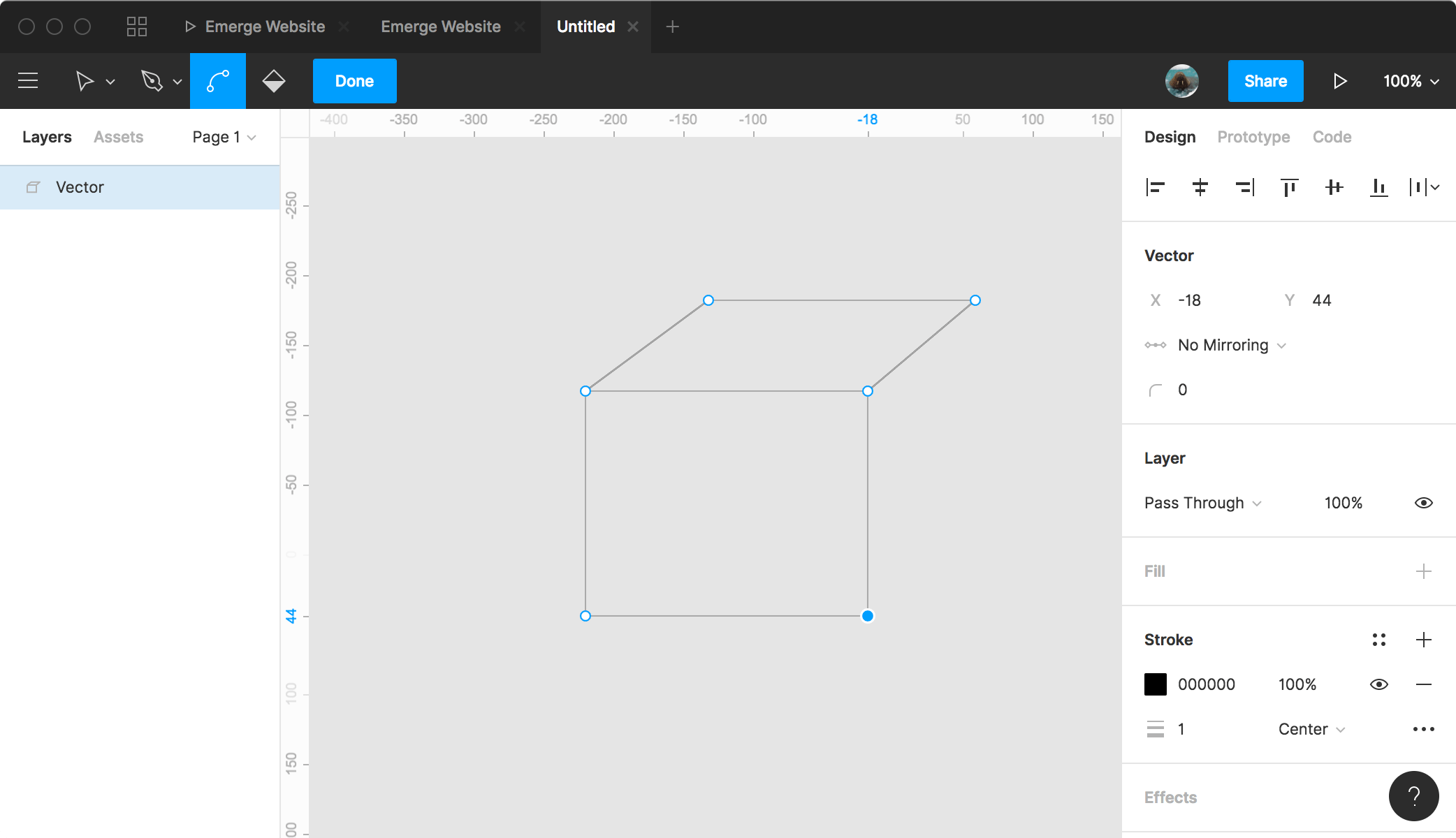
As a design utility, Figma has a mild departure from other vector applications, chiefly how it handles vector drawing. Figma allows for multiple points from a single point, called Vector Networks which honestly of all the innovative features probably is the most singularly interesting from a purely design sense. It's so simple when you see in action, yet powerful. I have a feeling this will become widely copied if it hasn't already. I'd rank this as even more impressive than the collaborative designing as we've seen collaborative design inadvertently via Google's G-Suite, and in online games (while I haven't even played it, Minecraft's long appeal seems to be collaborative designing).

Pictured: Vector network allow for multi-point vector points
That said the limitations of view-only do not allow a user to manipulate it. When assets are handed off to me in Sketch, often move things around and generally make a mess of the file, extracting, manipulating, measuring. Figma does not have a user like me in mind. Instead, all manipulations are meant to be towards the end game of a finalized design, not a deconstructed one. Sketch continually annoys me with its autosaving, and no real "save as" function, but I've learned to live with it by duplicating a file and denoting it as "final" vs. "edited," to know which I've messed with. Figma, when I'm not granted ownership, doesn't let me duplicate to a file I can manage, and do my Jack-The-Ripper disemboweling to get the assets I want.
Figma's handling of images isn't nearly as exciting. Placing images means uploading, which is a step backwards but part of the process. Cropping is well done. For basic crops, unlike most vector apps that require creating a vector object, and placing as a mask, Figma lets you more easily quick and dirty crop on the image. The area outside of the crop is designed when adjusting as transparent. It's a nice touch as you can easily see the remainder of the image and its contents. Also as options are CSS-like abilities to cover, fit and contain within the basic crop. I especially like this as its akin to how a web browser treats an image with object-fit. Opening large projects though can take a few seconds images to appear, as they are being downloaded. It's tolerable.
Figma also allows for basic prototyping, akin from what I've seen more like MarvelApp than anything nearly as robust as the interaction designer tools like Flinto and Principal. It's functional, easy to use, and comes baked-in as opposed to Sketch's requirement of a separate utility. It's worth mentioning but I haven't played with it much. It's reasonable that Figma could be used for static wireframing/prototyping.
Then the rough edges start to show

Currently, there isn't an export option for the original asset. You can export your cropped image, but not easily grab the original asset. This isn't so great if you're using an image as a background image or an image that'll be using object-fit. Plus, there's no real "native" resolution displayed. If I export a 2x or 3x version of an image, will I get a blurry version? Who knows. There isn't a native export or native resolution listed for an image. I can't copy and paste out either as Figma's non-native experience means the clipboard isn't a truly native experience. Sketch allows you to copy as CSS, copy as SVG, copy Styles or copy the object in Sketch. Figma does not.
In fact, Figma's handling as an asset manager sucks. Unlike a Photoshop smart layer, or at least in Sketch, the ability to grab the source contained within the sketch file, Figma is a black box.
Figma also has a weirdness when copying out text (the only asset you can extract from a document to other applications) often adding in extra return carriages to the beginning. It's hardly a deal breaker but adds an element of unpredictability and clean up. This isn't something that one normally faces in design applications so it's worth noting.
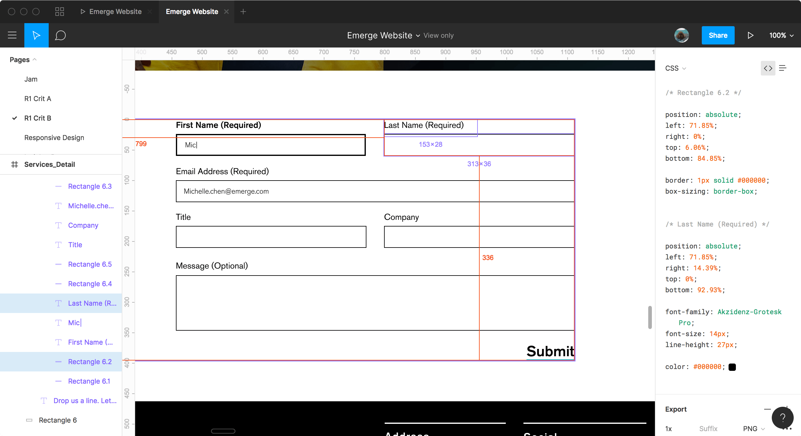
Probably the issue that draws the most ire from me is stupidity of the onscreen measuring, that is obsessed with the document borders and not relationships between objects. Figma loves to tell you how far an object is from the edge of screen but can be pain to get it to show relationships. Highlight one object, and you can hover over another object and it'll show you the distance but sometimes to the corner and not edge. It's also really bad about text, only calcuating to the container for the text and not the text itself. This feels significantly behind Sketch.
Then there's SVGs. Figma is annoying, select any two vector elements, and you'll get two separate SVGs. Exporting a group is mystifying experience, and all strokes are converted to fills making for not the smallest SVGs. Trying to get an icon export lead a designer on my team re-drawing the icon in Illustrator. That's.... not good. Exporting gets even dumber, select two objects? You'll get two files. Oy. Sketch it is not. The rulers seem surprisingly dumber too.
It also doesn't win any awards for multipage layouts which took Sketch awhile to figure out but, a multipage design exists as basically Pages, in an all or nothing design. It's there, but there's little beyond what one is used from Illustrator to Sketch.
Also, being a web app means a complete lack of plugins. Unlike, say, Atom which is probably the pinnacle of Electron applications, Figma has no such architecture for plugins... for better or for worse. This isn't surprising but one of the big draws for Sketch is major services releasing plugins for Sketch, like Sketch For Marvel and Craft by InvisionApp. This may scale in importance depending on who you are, but Sketch has plugins, Figmas does not.
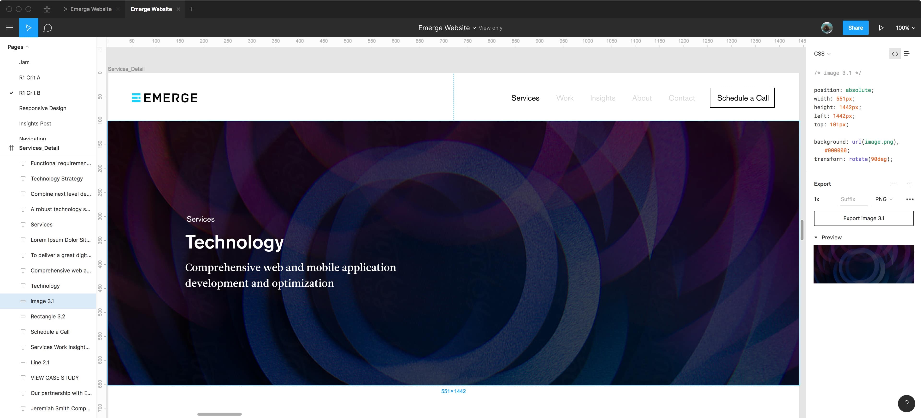
Figma also touts that it outputs CSS code and more than Sketch. Output it does but useful it is not. It gets the basics right: font-family, border, color, font-size, which is great. The rest of what it outputs is a head-scratcher. It's a bunch of absolutely positioned insanity, I suppose in some sort of nightmarish world, one could make a non-responsive website using, but for just about any sane person it's useless. It's a slightly lesser version of Marketch.
A higher tier
Figma also offers a secondary tier.... a very expensive one at $45 a month, per user offering a suite of features that I did not have access to thus cannot comment on, beyond that they exist and they are expensive, almost exclusively related to access controls to designs and ownership.
Personal Take
Figma's best features over Sketch are:
- Ability to share projects easily, no software to download to view.
- Cross Platform.
- Collaborative design on the same file in real time. I don't know anyone who works this way but it's easy to see the value.
- Vector Networks. It's so simple yet so powerful, why haven't other vector drawing utilities had this? Truly a leg up on other vector apps when it comes to pure illustration.
- A free-tier that's meaningful for people looking to learn (no private designs, limited undo history to a month, limited a month of people per project)
Sketch's best features over Figma are:
- Predictable and clear exporting
- Native OS functionality making for importing/copy and pasting such
- Exceptionally strong community support via mature plugins and visual libs
- More adherance to SVG standard
- Better text editing.
- Better onscreen measuring.
- Better asset handling.
- No permissions when handed file needed to be granted to gain full access.
- No required subscription for levels of access, less expensive ($99 for a year of updates + no requirement to continue subscription vs $144 and requirement for subscription for private designs/$45 a month for organizational users) and includes Sketch Cloud access for free.
- Most of Figma's big features are matched with Sketch's plugins (sans real-time collaborative design and Vector Networks)
There's plenty of head-to-heads of Figma vs. Sketch, but as a developer, end of the day, currently, I prefer Sketch, versioning issues and all. I can pull and edit and pick apart assets, and the exporting is vastly superior. The auto measuring in Sketch is also far more useful, measuring to edges and spacing seems more intelligent. Sketch also feels like a native app, whereas Figma comes as close as I've seen as a web app, in the same tier as Atom and Slack but with those "this isn't right" moments like when copy and pasting. Sketch's cloud feature suffers the same issues that Creative Cloud does: everyone needs to buy in to fully appreciate it. The best analogy I can use is Figma is Google Docs. Sketch is Apple's Pages. (Don't over think it too much).
It's also fair to say I like Figma but I don't love it. It's not nearly as polished as I'd expect for an application that has the audacity to ask for either $144 or $540 a year for a seat. Figma, you're interesting but $144 is pricey and holy hell you are not worth $540 a year.
Sketch isn't problem free, I still hate its file saving. Manipulating text still isn't as powerful as I'd like either. Auto-save is great, but it also makes for strange moments when you want to "Save As" and leave your original intact. I imagine this could be because of the paradigm I grew up with in the 90s.
The future lies somewhere between Sketch and Figma. Some features are a novelty: I can see value having multiple designers able to work on a singular design but I also wonder how many projects need this ability. That said, the killer app is handing a URL to a client or internal team member and knowing that it will remain current, and anyone can view it natively with or without a license. That for some might tip the scale a good number of users and I don't blame them.