Creating an SVG Fill animation
Recently I was tasked with creating a fill animation on an SVG; a request has come up a few times recently even for my company's website. The animation as described would rise up to reach a certain predetermined point and stop, like a vertical progress bar. I didn't find any 100% useful guides but was able to piece together from previous SVG work, and a few good stack overflow finds the basics.

Creating an SVG fill animation requires some knowledge of a graphics program like Sketch or Illustrator. For this example, I'll be outlining what I did in Sketch to treat the graphic, but this is not Sketch specific. I'll do my best to make this novice accessible but some basic understanding.
Step 1: Treating your graphic
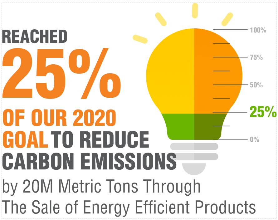
Creating a fill animation requires the right graphic. To pull off this animation, we need a polygon that's a solid color for the vertical progress bar effect. This particular animation will rise up to the 25% mark as outlined by the article.
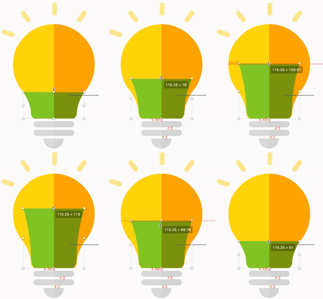
Originally this graphic's green fill was a separate layer. While this a correct way to illustrate this, it's not easily animated. If we were to stretch the image, the effect would appear like the animation below.

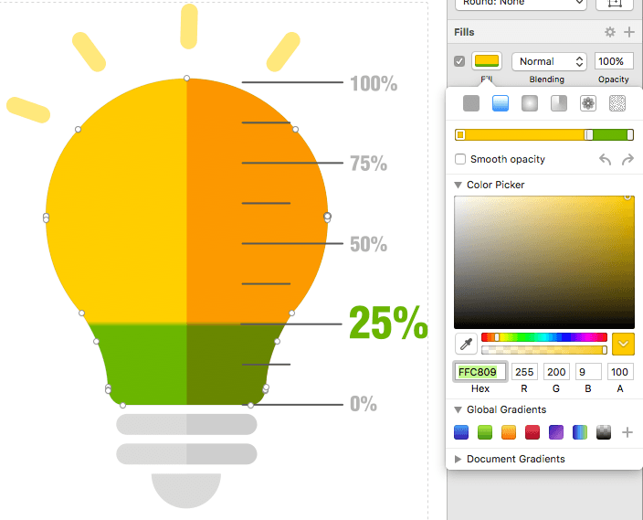
Instead, a much simpler solution is to use a gradient fill. Due to the trickiness of SVGs and gradients, make sure the gradient points extend the entire length of the fill; otherwise, the start and end points can create problems. Sketch is a little picking about gradient points, so don't worry if you can see the gradient transition. We will correct this in the XML of the SVG after exporting. Make sure you name your SVG polygons as this will become very useful for CSS as these will become the IDs for each polygon.

Step 2: Export and paste
Note: A caveat of the SVG format is that it requires being inline on a page for CSS to be able to target the SVG nodes. If it's linked via SRC, CSS is then unable to target the XML in the SVG. We want CSS control as we will be using it to set the gradient.
Paste in the SVG into your HTML (feel free to remove any XML comments in the header). There are two things to observe: All the SVG gradients are declared <defs>in the section of SVG and that the gradient is linked within the polygon.
Step 3: Creating more gradients
To create our animation we're going to need three gradients:- Default Gradient - this will be our default unfilled state
- Animation Gradient - this will be our gradient that contains <animate> tags within our gradient
- Finished Gradient - this is the final animation state, this will be our simple bobbing animation that loops infinitely after the animation has completed
In the defs, I'm going to do three things: first name gradient and secondly set the second stops to the same endpoint to create the illusion of a solid line. Lastly, I need to make the light bulb "empty" so I'll set the offsets of the last two gradient stops to 100%.
  <linearGradient x1="0%" y1="0%" x2="0%" y2="99.9334221%" id="bulbGradient-default">
      <stop id="stop1" stop-color="#FFC809" offset="0%"></stop>
      <stop id="stop2" stop-color="#FFCF06" offset="100%"></stop>
      <stop id="stop3" stop-color="#6CB31D" offset="100%"></stop>
  </linearGradient>
Copy and paste and rename the gradient to match this pattern. It'll take a bit of trial and error but set the final stop offset points.
  <linearGradient x1="0%" y1="0%" x2="0%" y2="99.9334221%" id="bulbGradient-animate">
     <stop id="stop1" stop-color="#FFC809" offset="0%"></stop>
     <stop id="stop2" stop-color="#FFCF06" offset="73.5%"></stop>
     <stop id="stop3" stop-color="#6CB31D" offset="73.5%"></stop>
 </linearGradient>

 <linearGradient x1="50%" y1="0%" x2="50%" y2="76.9334221%" id="bulbGradient-end">
     <stop id="stop1" stop-color="#FFC809" offset="0%"></stop>
     <stop id="stop2" stop-color="#FFCF06" offset="73.5%"></stop>
     <stop id="stop3" stop-color="#6CB31D" offset="73.5%"></stop>
 </linearGradient>
Step 4: Animation
We can't target the defs via CSS, but we do have another tool, SMIL animation. SMIL is depreciated, but it works for linear gradients. SVGs can contain animations. SMIL is supported in all browsers sans IE/Edge (more on that later). For this example, we're going to use animate Animate consists of the attributeName (the part we want to animate in our parent), duration, values and repeat count. Normally we'd use CSS animations as they're more well supported but as of writing this, I've yet to find any way to animate gradients without complex JS. Within our stop tags, we'll add the animate values. Fortunately, for both animations, the last two stops will contain the same animation to continue our solid line effect.
If we do not declare a begin property, the animation will automatically regardless if we can see it once the DOM is ready. To prevent this, we need to set the begin time as indefinite otherwise our animation will begin to play. We may not even see our animation or see a strange jump. We also need to give each animate property an unique ID so we can target them.
     <linearGradient x1="0%" y1="0%" x2="0%" y2="99.9334221%" id="bulbGradient-animate">
        <stop id="stop1" stop-color="#FFC809" offset="0%"></stop>
        <stop id="stop2" stop-color="#FFCF06" offset="73.5%">
            <animate attributeName="offset" dur="2s" values="1; 0.735;" repeatCount="1" begin="indefinite" id="bulbGradient-animate-stop1"/>
        </stop>
        <stop id="stop3" stop-color="#6CB31D" offset="73.5%">
            <animate attributeName="offset" dur="2s" values="1; 0.735;" repeatCount="1" begin="indefinite" id="bulbGradient-animate-stop2"/>
        </stop>
    </linearGradient>

    <linearGradient x1="50%" y1="0%" x2="50%" y2="76.9334221%" id="bulbGradient-end">
        <stop id="stop1" stop-color="#FFC809" offset="0%"></stop>
        <stop id="stop2" stop-color="#FFCF06" offset="73.5%">
            <animate attributeName="offset" dur="5s" values="0.995; 0.95; 0.995; 0.95; 0.995;" repeatCount="indefinite" begin="indefinite" />
        </stop>
        <stop id="stop3" stop-color="#6CB31D" offset="73.5%">
            <animate attributeName="offset" dur="5s" values="0.995; 0.95; 0.995; 0.95; 0.995;" repeatCount="indefinite" begin="indefinite" />
        </stop>
    </linearGradient>
Step 5: CSS
Finally, we need to set up our CSS so control our linearGradient, each gradient being assigned to a CSS state. The following is written in scss.
    #bulb-icon {
        #Bulb {
           fill: url(#bulbGradient-default);
        }
      }

      #bulb-icon.animate {
        #Bulb {
           fill: url(#bulbGradient-animate);
        }
      }
      #bulb-icon.end {
        #Bulb {
           fill: url(#bulbGradient-end);
        }
      }
What we have is a pre-animation state gradient, the actually animated gradient, and then the final state after the animation for the gradient.
Step 6: Javascript
First, we need to create objects from our animate tags, this way we can access the methods available to them.
    var bulbstop1 = document.getElementById('bulbGradient-animate-stop1');
    var bulbstop2 = document.getElementById('bulbGradient-animate-stop2');
After that, it is time to write simple our JS. We want to create an animation based on time via JS using a simple setTimeout function to change the class after it is done. The animation is 5 seconds long, so I've made the setTimeout a few ms shorter than 5 seconds. To trigger the animation I need to use the beginElement() method. This initializes the animate.
    function animate(){
      $("#bulb-icon").attr("class", "animate");;
      setTimeout(function(){
        $("#bulb-icon").attr("class", "end");;
      }, 4995);
      bulbstop1.beginElement();
    	bulbstop2.beginElement();
    }
    animate();
Note: I learned about the beginElement() method from a great blog post at properdesign.rs which I highly recommend reading.
IE Support
As mentioned previously, Internet Explorer and Edge do not support SMIL with no plans to support SMIL. However, we can add SMIL support with Fakesmile, an Internet Explorer shiv.
Our final Product!
See the Pen SVG Animation by Greg Gant (@fuzzywalrus) on CodePen.
Update 10/20/17: Added in more info about JS. Added the restart animation to CodePen. Added info about beginElement