Ditching Helvetica for 10.10 Yosemite, switching back to Lucida Grande
I’m not the only one it seems that isn’t fond of Helvetica Neue for my OS font.
Despite its grand reputation, Helvetica can’t do everything. It works well in big sizes, but it can be really weak in small sizes. Shapes like ‘C’ and ‘S’ curl back into themselves, leaving tight “apertures”–the channels of white between a letter’s interior and exterior. So each shape halts the eye again and again, rather than ushering it along the line. The lowercase ‘e,’ the most common letter in English and many other languages, takes an especially unobliging form. These and other letters can be a pixel away from being some other letter, and we’re left to deal with flickers of doubt as we read. - Tobias Frere-Jones
And while we’re on the subject of screens, sure, type legibility across the board is going to get better with the advances in Retina displays. But until everyone has Retina displays, you’re going to have a lot of squinty, frustrated Apple users. Helvetica is just not fun to read at small sizes—in books, on posters, or on iPads—and it never will be. - Gizmodo
Lucida Grande despite the designer bitch-fest was a workhorse font, akin to monospace fonts like Courier. While Helvetica has its place in design, it’s an inferior font at small type faces, retina display be damned.

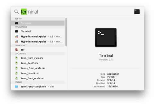
Pictured: Yosemite search using Lucida Grande. Lucida Grande may not be the end all, be all of typography but its legibility is superb at smaller resolutions
Fortunately for those of us addicted Lucida Grande or at least feel that its a superior option for onscreen legibility, there’s a fix for that. Lucida Grande
Simply download and install the zip from github and run the application. Reboot and you’re back to running Yosemite (tested on the public release) with Lucida Grande.