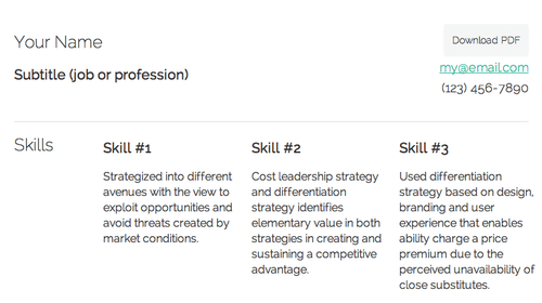
A lightweight elegant Résumé using HTML+CSS (responsive design)
I haven’t used this blog to promote my own work hardly at all but I figure this merits sharing.

Not everyone is a front end developer and even among us, few of us really enjoy laying out our resumés. Portfolios are exciting, and flashy. Résumés are not, nor should they be. Nor should they be PDF only. What they should do above all else is cleanly communicate information quickly to busy people.
During my job hunt, I was tired of attaching PDFs to e-mails and annoyed with some job application systems that asked for an optional Résumés, only to allow .doc format.
I do not own MS office and wonderfully formatted Resumés in Pages lose their luster after conversion. It was time to address this problem.
I developed a simple HTML/CSS resumé, with a simple grid system, with a few minor CSS3 effects and the wonderful HTML5 download tag in the <a> tag. I can only testify that this is the resumé help landed me my current job as User Interface Engineer.
I’ve never been a hiring manager but I’ve had to comb through résumés of applicants and I can tell you what I valued: Clean, clear and concise. While I am a design geek, at the point of a résumé, I’m in an information collecting phase, so the design should reflect that.
Go crazy on portfolios, but be reserved on résumés. Your resume shouldn’t look like a generic word document but it should be relatively free of ornamentation.
You can see a live preview here.
For the nerds out there, I’ve put this up on Github but you can download it as .zip here. Its tiny, 200k. Its also simple. HTML newcomers can simply replace out the text and more seasoned designers/developers can take the time to tweak it. I’ll also be working on a print.css file eventually for the world where things are still printed.
Currently it has all of two templates based on experience. I plan to continue developing out this project and improving it to be ultr