The 4k buzzword and what it means for the web...
Today I gave presentation on the 4k web and what it means to our designers. Our designers are sharp but I figured I’d share my notes, I spent too much time on it, creating charts.
I wrote a blog post about the 4k web, go read it here.
What is 4k?
- 4k is an umbrella term for multiple screen resolutions, most commonly 3840 × 2160.
- The resolution bump started in Hollywood for digital work flows, for scanned film negatives and digital video shot at a resolution that was considered “Film” grade. Projectors and very large screen TVs soon followed, replacing the previous generation of “2k” digital projectors.
- Outside of cinema, 4k video content is relatively scarce due to bandwidth constraints. Currently YouTube offers experimental 4k content and Sony Pictures offers a digital-only movie store.
- Roughly a year and half ago, the cheapest 4k displays cost roughly $2000, making them almost exclusively a high-end luxury item.
- 4k displays recently dropped in price (and size) making them affordable to the common person. Computer monitors carrying a 4k resolution can be had for as little as $500.
Retina For Desktop
Time for a bunch of numbers
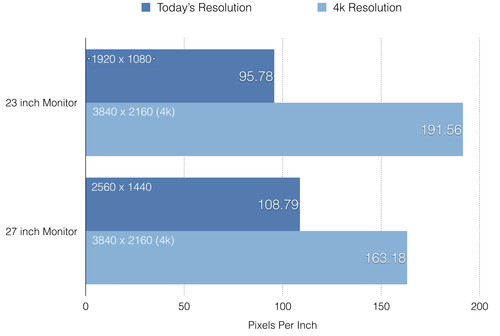
- Previously, the standard resolution for a 21-24 inch monitor has been 1920 x 1080 aka 1080p (or 1920 x 1200 depending on aspect ratio).
- Currently there are 24 inch - 30 inch 4k computer monitors on sale at different price points, carrying typically a resolution of 3840 × 2160, twice the resolution of 1080p and 4x as many pixels.
- TVs range from 32-105 inches, and typically carry the same 3840 × 2160 resolution and (16:9) aspect ratio. Extreme high end “5k” ultra wide screen TVs carrying a staggering 5120 x 2160 resolution have demoed at several press releases. 8k TVs also are in the works.
- 4k isn’t different than current “retina” display devices like the MacBook Retina, or mobile devices. It means that desktop displays will have roughly 1.5x - 2x as many pixels-per-inch (PPI) than current displays available today.
- However… 4k displays range from as small as 21 inch to as large 105 inches, meaning the that 4k doesn’t always mean retina.
- A 42 inch 4k monitor/TV has roughly 105 Pixels-per-inch, the same amount of pixels per inch that standard computer monitors have like the iMac 27” and iMac 21”.
Why is 4k special?
Desktop computers have been the last roadblock for adopting resolution independence strategies that include non-mobile devices, (phones/tablets).
In the near future, almost all computers, and most displays sold will feature high density displays, roughly 180+ PPI. This marks a drastic change in resolution as monitors from 1990-2012 have almost exclusively been 80-110 PPI.
Too many screen sizes
To address the massive increase in screen sizes and pixels-per-inch, designers have developed several strategies for resolution independence.
They are as follows:
- Responsive design
- High resolution images / resolution independent formats
- Content delivery methods
Designing for the Future
And other clichés….
- Some elements are naturally resolution independent such as anything rendered by pure CSS (effects rendered by a web browser like shadows, gradients, shapes), typography (fonts and icon fonts) and vector formats like SVG and AI (Adobe Illustrator).
- Regardless where these assets are displayed, they will be rendered in the highest resolution possible as the shapes are represented by math instead of pixels.
- Raster formats (things that contain pixels instead of maths) are not intuitively “resolution independent”. These are typically photographs, common formats include JPG, RAW, PNG, BMP, GIF etc.
Does this mean that formats like SVG are the future?
Not entirely. Simple graphics are easily represented by math. Photographs and complex images are not. For a full explanation of raster vs vector, go check out this article.
- Anything that is a photograph or complex image needs a higher resolution version for the screens.
- Photos, complex images and video (anything that is not vector based) are the Achilles’ heel of resolution independence.
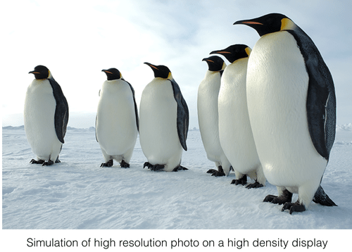
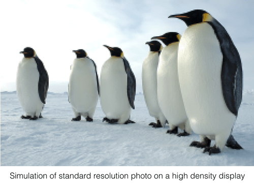
- Upscaling raster assets beyond their native format results in blurry pixelated results for high density displays.
- Serving high resolution assets to users without high density displays gain no benefit.
- Larger images (videos/animation) result in much higher asset file sizes thus consumes more bandwidth, taxing users connections.
- Not all screens have the same PPI (some screens are sharper than others)
Designs today not only need to be responsive, they need to be include high resolution assets to appear sharp on high density displays.
Strategies for resolution independence during design phase:
- Use vector assets when possible.
- (including SVGs or formats that can converted into SVG).
- Make liberal use of Smart objects in Photoshop. Switch to designing in vector programs like Sketch and Illustrator
- They can contain much higher resolution photos and scaled down in the design while leaving the original image at its full resolution. It results in higher PSD file sizes but makes it possible for high density images to be extracted.
Content Delivery Methods
High resolution assets require more bandwidth and vector images require browser compatibility but fortunately we have many tools we can use!
1) Ability to detect high resolution displays via CSS and Javascript; use polyfills and picture elements
Scripts like retina.js are able to detect pixel density and serve up higher resolution versions of your assets. This means users will only see the retina versions of images if their device supports them.
2) PNG fallback for old browsers that do no support SVG
Scripts like modernizr.js are able to detect if a browser supports SVG and swap in PNGs for older browsers like IE8 and Android 2.2. SVGs even can support PNG fallbacks when hardcoded into a page without javascript. Icon fonts are supported in older browsers that do not support SVG, which works for simple icons.
3) Better compression
Tools like ImageOptim and ImageAlpha allow us to further compress images, often without affecting the image quality or reduce the quality without much perceptual damage. Also, high resolution assets can be served up more highly compressed.
4) Content Delivery Networks (CDNs)
Content delivery networks can delivery multiple quality scales based on compression + resolution and serve these up to fit scenarios based on resolution, screen pixel densities, and even bandwidth*.
5) Bandwidth Detection
Emerging technologies allow to detect if the user is on narrow band such as Edge or low 3G signal strength, slower DSL connections. High resolution assets can be served when user is has appropriate bandwidth.