Yes, that’s a nice mockup but is it really an improvement?
iDownloadblog (a generally much more worthwhile read than bandwidth waste, Appleinsider.com) recently ran “This jaw-dropping concept totally reimagines Apple’s dull OS X Messages app” which contained screenshots from behance.net’s Message Concept App.

Behance’s mockups iOS 7ify Messages
Lately, I’ve seen quite a few mockups of Apple products, a trend that started with hardware renderings. Now with the advent of dribbble and the clamour to beat Apple to its own punch, I’ve seen some interesting-yet-utterly-flawed-iOS 7 mockups that garnered a lot of praise for looking pretty (Slide to unlock at the top of the screen?).
Now I’m neither a fan of Messages nor a user of messages but as much as the visuals look “good” they are a fundamentally wrong from a user-interface perspective, as scope and functionality should lead design, not the other way around.
Rarely is IMing front and center, but rather an activity that compliments web surfing or work or gaming. Its certainly not a full screen activity, nor one that necessitates any more screen real-estate than it takes to deliver an IM.
Take Adium, the most popular alternative to messages.
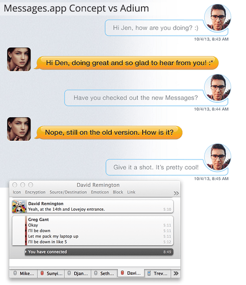
In half the space of the hypothetical Messages redesign, Adium conveys oodles more. Information density isn’t always a good thing, but Adium isn’t presenting an overabundance, and its configured to my personal preferences.
Pretty it is not, but functional it is.
While negative space is something to appraised, think about the most beloved desktop interfaces today: Be it Chrome, Pages, Transmit, Aperture, 1password… All of these apps interfaces get out of the way to present the information as clearly and cleanly as possible with often little dressing. Users aren’t locked into one-app-at-time, and thus shouldn’t be forced into the constraints of mobile user interface design.
For the would-be designers looking to break into the world of user-interface design, If you’re going to convince me that your user-interface is actually interaction design, show me the actual flows… and for the love of Steve Jobs, don’t hide full window mockups.
Give me any day a exceptionally well-thought out wireframe than a pretty PSD. The paint can be applied later. Otherwise you’re putting lipstick on a pig….